Thursday, 28 February 2013

11 Must Use SEO Tips for Web Designers

 11 Must Use SEO Tips for Web Designers
Today most web designers do more than just design the look and feel of a web site. They often play a major part in writing the front end code. This means that a big part of the SEO or Search Engine Optimization responsibilities should fall on the designer. However, there is a large number of web designers that don’t understand this subject well enough to create a site that is fully optimized for search engines.
This article is here to provide some important tips that will aid the average and even above average web designer in improving their SEO skills.

1. Make the code prettier than the design

When building the front end of your site, make sure to use semantic code. By using descriptive tags to structure your pages, search engines will be able to read and have a better understanding of your content. This will also make the process of styling your site much easier and cleaner.

2. Use but don’t abuse your keywords

Keywords are the words that describe your content. It’s important to have them appear in strategic places throughout your page, such as: URL, title tag, and main heading tags. It’s also important to have it appear often in the body of the content, but not too often, which might cause your content to be penalized for keyword stuffing.

3. Avoid using Flash for navigation

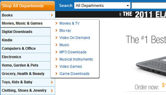
As tempting as it is to whip out some nice looking drop down effects for your site’s navigation using flash, don’t do it. Search engines have trouble reading flash files, which means the links used in the navigation can’t be followed.

4. Use unique page titles

Each page on your web site should have a title attribute, and each title should be unique. If you use the same title for every page, search engines will think that every page on your site is about the same subject.

5. Don’t forget about images

Make use of the alt attribute of an image to properly describe it. As smart as search engines are, they can’t see what an image looks like. Failing to this can cost you substantial traffic from image searches.

6. Don’t use generic links

Search engines place a high importance on links. So when linking to relevant content, be sure to use a word that describes the content. For example, if you were giving your reader a link to learn more about Photosop, use something like “Learn more about Photoshop” as opposed to just “Learn More”.

7. Don’t use images to replace text

As designers, we always want to make things look as good as possible. This means sometimes replacing ugly browser rendered heading text with a nice smooth image. Try to avoid doing this. Again, search engines can’t see the contents of an image, and this is where you should be putting your keywords.
Edit: Looks like I misspoke(or mistyped) on this one. There are valid ways to accomplish this, such as FIR.

8. Use AJAX sparingly

Ajax is great for enhancing the user experience, but try not to over do it. Content generated with ajax can’t be linked to. A good rule of thumb is: if what you are loading with AJAX can be an individual page, then avoid using it.

9. Get indexed quickly

To get your site indexed in search engines in a timely manner, try getting it linked to by a popular site in a related niche. Submitting it to Google also works, but sometimes it can take several days if not weeks.

10. Build incoming links

The number and quality of incoming links plays a big role in the placement of your site in search results. Having quality and unique content is a good way to get people to link to your site. Another way is to be generous with your own links.

11. Use a consistent URL

When you build a site, decide from the beginning if you want to use or drop the “www”. Once you decide, stick with it. Search engines, for example, see www.webdesignledger and webdesignledger.com as two different sites and as duplicate content, which they do not like.

source: http://webdesignledger.com/tips/11-must-use-seo-tips-for-web-designers
 

Thursday, 21 February 2013

top 5 Tips for SEO Web Design – A Guide to Onsite Search Engine Optimisation

Search engine optimisation (SEO) has come a long way in the last decade.
SEO graphic
When the phrase first appeared, SEO web design meant little more than stuffing your cool 90’s website with whatever terms you were optimising for, getting listed on DMOZ, and populating your metadata for the search engines to analyse. Search engine marketing and SEO optimisation were basically as primitive as the search engines themselves; before the first algorithm was written to spot keyword-stuffing, you simply typed your key term more times than anyone else to get the top spot in Yahoo.
But, oh boy, have things changed. In their endless search to provide users with the most appropriate, authoritative and high-quality suggestions for a given search term, the algorithms and web metrics used by search engines such as Google to index, analyse and understand the contents of the web have become increasingly advanced.
The complexity and relative importance of SEO services has evolved alongside these developments, as the SEO expert’s job of attaining top positions in search engine results (SERPS) has become ever more challenging and competitive.
But don’t be put off. Search engine optimisation, internet marketing and social networking all start with solid website design. Building from the ground up with these 6 SEO tips will give you a huge head-start in the race for those coveted and profitable SERPS positions.

1. Keywords

Keywords, key phrases, and key terms are the bread and butter of SEO and search engine marketing. Intelligent keyword selection, strategy and analysis are a large part of how it’s done. Your keyword choices could reflect what you do, where you are, what you love, your expertise, your USP or maybe your brand terms. Be realistic; for example it might be too late to take on Amazon for the term used books.
Visualise your chosen key terms as the ‘real estate’ you will be competing for.
Head terms are your top-level phrases. If you were selling SEO web design, your head terms would include web design, SEO, website design, search engine optimisation and plenty more. These head terms are normally the most competitive in a field – so use variations, think laterally, look for an opening, and you’ll be getting somewhere.
Your long tail or tail terms include phrases that relate to your head terms. Get creative; identifying and owning the right long-tail terms is a great way to corner your own part of a competitive market. A few examples for our imaginary web firm might be WordPress website design, e-commerce SEO, ‘Mytown’ web design, celebrity SEO… etcetera.
Do as much keyword research as possible. You can use tools such as Google Adwords keyword tool, Wordtracker, SEOmoz, and don’t forget the invaluable Google search box itself. Since Google introduced the ‘Instant’ search results this became even more useful – the list of auto-complete suggestions can show you what the world is searching for. Select and list your head and long tail keywords and terms very carefully before you go any further.
Keyword analysis spreadsheet

Using your keywords

So, you know what your keywords are, but what do you do with them? Well, search engines need to be shown exactly what your website is all about in order to drive website traffic to you. Your chosen keywords must then be used throughout the website design process.
Key terms must be included in:
  • Title Tag
  • Keywords and meta description
  • Navigation and menus
  • Business slogans
  • Your URL
  • Bullet points
  • Alt text for images
  • Image descriptions
  • Title attribute in links
  • Your main page or product copy
  • Internal and external links
  • Footer links and sitemap
  • Breadcrumb trails
  • Header Tags – H1, H2 and H3
But don’t overdo it! Remember that SEO optimised content should be useful, authoritative and well-written. Unnatural repetition or ‘keyword spamming’ will not help you rank and can even cause penalties. Google works by trying to link people to the most relevant optimised content on the web, and importantly it tries to link them to what they will like. So if it looks like spam to you – don’t publish it.
As soon as your website goes live, start tracking and refining your keywords based on referrals and performance. Google Analytics should be installed on your site; it is a good, free way to get started with web traffic and keyword analysis, and much more.

2. Navigation

Many websites could do wonders for both user experience and their search rankings by improving their navigation. Think about how the following advice might help you elsewhere in your web site design; this is crucial stuff.

Make your navigation both search engine and user friendly

If you have heard the term semantics on your travels, navigation is a great place to begin implementing it. Quite simply, the term semantics refers to the study of meaning; the relationships between signifiers (for us, words) and what they stand for. How does it work?
Google’s spiders are hopefully crawling (having a good look at) your website on a regular basis.
They might not be clever enough (yet!) to get your jokes, but by analysing your links, internal navigation and content, they are using advanced semantics to judge quality based on the organisation of information on your website.
For example, if I you built a semantically correct drop-down navigation menu labelled COMPUTERS, that expanded to read LAPTOPS – DESKTOPS  – NOTEBOOKS, and each of those expanded into brands, models, screen sizes or other variations, that information makes sense to both Google spiders and your customers.
Utilise semantic organisation of information not just in your menus, but right across your entire website, integrating the data you collected in your keyword research.
Well-ordered, semantic ‘beauty’ is why Wikipedia wins so often in the SERPS. Wikipedia is a great example of organic search engine optimisation which puts out strong ‘authority signals’ for many subjects and key terms.

Navigation Pitfalls

A classic web development mistake which negatively impacts SEO is using images as buttons for navigation. Always use text, as words will be indexed and understood in relation to where they link and what is around them. Yes you’re getting it – semantics again.
If the link to your web design page was a picture called button 1, why would a search engine follow it? The search engine would also be ‘upset’ that the linked page wasn’t full of great information on button1.

Words, text, and html links are always the best choice.

Many of the pretty effects that you might associate with Photoshop, Javascript or Flash-based menus can now be achieved with text-based CSS3. Any pretty features built in CSS have the advantages of being compatible with more browsers, are search engine friendly, and provide faster loading times. Flash and Javascript should generally be avoided at all costs, as they do not present open, easily understood information to search engines.
Keep it simple, keep it text-based, and use CSS.

3. URL’s and folder names

Your URL (uniform resource locator) is a great place to start to optimise your web design. Every page on the internet has a unique URL, and this is the part of your website that is most referenced and repeated elsewhere on the web.
A really bad URL, unhelpful to both people and search engines, looks something like this one;
http://www.jcpenney.com/jcp/X6.aspx?GrpTyp=STY&ItemID=185a337&deptid=70732&dep=MENS+SHOES&catid=81551&pcat=MENS+SHOES&cat=sandals&NOffset=0&pcatid=70732&Ne=8+3+14+1031+4294957900+18+904+833+949&N=4294933639+263&SO=0&cattyp=RLE&Nao=0&PSO=0&CmCatId=77583|81551
Seriously, one of the largest US retailers can’t get this right? If the webmaster at JC Penney had any sense, they would have basic re-write rules or a CMS plug-in enforcing something like this;
http://www.jcpenney.com/mens-shoes/sandals/skechers/journeyman-sandal
Be better than JC Penney! Apply our good old semantic principles and your key terms to URLs and folder structures throughout your site design. Everyone will like your website more.

4. Images

Another often overlooked area of SEO web development is the correct handling of images.
  • To optimise your images for fast loading times and clarity, compress them to make the file sizes smaller.  Aim for between 30 and 100kb, with a resolution of 72dpi
  • Always use the ‘alt tag’ attribute to give the search engines something else to read
  • Place images in context with your page content; make sure they are relevant and have appropriate titles and captions
  • Put all your images in a folder called ‘images’ – because it makes sense!

5. Social Media

Ok, everyone is going on about social media networking, social media marketing, social media agencies and social media campaigns. You may or may not have realised what all the fuss is about.
Twitter birdie
Facebook is currently the most visited domain on the internet, and scarcely a day goes by without the latest Twitter scandal hitting the news. Most internet users are taking part in various social media networks, and web users are accustomed to seeing buttons everywhere on the web that enable them to promote or trash content.
Search engines are increasingly taking these ‘social signals’ into account, and are interested in the size of your networks, who you know, who follows you, and how active you are.
Obviously -  if there’s a chance that someone will click a ‘like’ button and potentially tell thousands of people about your great page, you really should give them the opportunity.
The simple act of Tweeting a link to your latest post or product increases it’s visibility. Many companies and individuals are using the power of social media to great effect, whether they use an established social media agency or simply take it all on themselves.  Ok, this is an obvious line, but – you should not get left behind!
At a bare minimum, take advantage of social media by joining Twitter, Facebook, Digg and LinkedIn.
Figure out how they work, and integrate the appropriate sharing buttons on all your website’s pages. Every time a user says ‘like’, posts a bookmark, or even writes a review, it will pass social link-heat back to your site and increase your visibility.

Summary:

  • Analyse, understand and implement your keyword strategy throughout every aspect of your website, paying attention to good semantic structure
  • Don’t use technology that obscures your content or makes for an over-complicated website – stay text based, stay simple
  • Pay attention to detail and information structures throughout, with clear navigation menus, URL’s, folder names and image properties
  • Leverage the power of social media; integrate the most used bookmarking and sharing tools wherever they are appropriate.
source: http://dailyseotip.com/5-tips-for-seo-web-design-%E2%80%93-a-guide-to-onsite-search-engine-optimisation/1667/
 

Monday, 18 February 2013

10 Excellent SEO Tips That Will Improve Your Web Design


10 Excellent SEO Tips That Will Improve Your Web Design

A great website design is important to any business trying to find success online, but if a website doesn’t have a chance at good search rankings, very few people may ever get to see it. To avoid having a website that is not search engine friendly, you simply need to take into consideration some basic SEO principles and good content development practices.

As a web designer, I put a lot of thought into what issues I have encountered and issues I have heard others deal with when building websites with SEO in mind. Here are 10 great SEO tips that can lead you to a more search engine friendly web design without sacrificing your creativity and style.

1. Make Sure Your Site Navigation Is Search Engine Friendly

Using Flash for navigation on your website can be bad news if you aren’t aware of how to make Flash objects accessible and web-crawler-friendly. Search engines have a really tough time crawling a website that uses Flash.

CSS and unobtrusive JavaScript can provide almost any of the fancy effects you are looking for without sacrificing your search engine rankings.

2. Place Scripts Outside of the HTML Document

When you are coding your website, make sure you externalize JavaScript and CSS.

Search engines view a website through what’s contained in the HTML document. JavaScript and CSS, if not externalized, can add several additional lines of code in your HTML documents that, in most cases, will be ahead of the actual content and might make crawling them slower. Search engines like to get to the content of a website as quickly as possible.

3. Use Content That Search Engine Spiders Can Read

Content is the life force of a website, and it is what the search engines feed on. When designing a website, makes sure you take into account good structure for content (headings, paragraphs, and links).
Sites with very little content tend to struggle in the search results and, in most cases, this can be avoided if there is proper planning in the design stages. For example, don’t use images for text unless you use a CSS background image text replacement technique.

4. Design Your URLs for Search Friendliness

Search friendly URLs are not URLs that are hard to crawl, such as query strings. The best URLs contain keywords that help describe the content of the page. Be careful of some CMS’s that use automatically generated numbers and special code for page URLs. Good content management systems will give you the ability to customize and "prettify" your website’s URLs.

5. Block Pages You Don’t Want Search Engines Index

There could be pages on your site that you don’t want search engines to index. These pages could be pages that add no value to your content, such as server-side scripts. These web pages could even be pages you are using to test your designs as you are building the new website (which is not advised, yet many of us still do).

Don’t expose these web pages to web robots. You could run into duplicate content issues with search engines as well as dilute your real content’s density, and these things could have a negative effect on your website’s search positions.
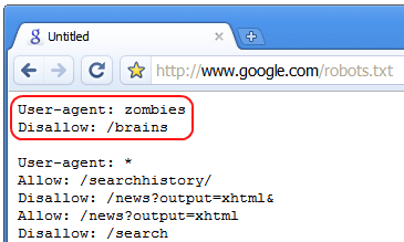
The best way to prevent certain web pages from being indexed by search engine spiders is to use a robots.txt file, one of the five web files that will improve your website.
If you have a section of your website that is being used as a testing environment, make it password-protected or, better yet, use a local web development environment such as XAMPP or WampServer.

6. Don’t Neglect Image Alt Attributes

Make sure that all of your image alt attributes are descriptive. All images need alt attributes to be 100% W3C-compliant, but many comply to this requirement by adding just any text. No alt attribute is better than inaccurate alt attributes.
Search engines will read alt attributes and may take them into consideration when determining the relevancy of the page to the keywords a searcher queries. It is probably also used in ranking image-based search engines like Google Images.
Outside of the SEO angle, image alt attributes help users who cannot see images.

7. Update Pages with Fresh Content

If your website has a blog, you may want to consider making room for some excerpts of the latest posts to be placed on all of your web pages. Search engines love to see content of web pages changing from time to time as it indicates that the site is still alive and well.
With changing content comes greater crawling frequency by search engines as well.
You won’t want to show full posts because this could cause duplicate content issues.

8. Use Unique Meta Data

Page titles, descriptions, and keywords should all be different. Many times, web designers will create a template for a website and forget to change out the meta data, and what ends up happening is that several pages will use the original placeholder information.
Every page should have its own set of meta data; it is just one of the things that helps search engines get a better grasp of how the structure of the website is constructed.

9. Use Heading Tags Properly

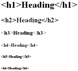
Make good use of heading tags in your web page content; they provide search engines with information on the structure of the HTML document, and they often place higher value on these tags relative to other text on the web page (except perhaps hyperlinks).

Use the <h1> tag for the main topic of the page. Make good use of <h2> through <h6> tags to indicate content hierarchy and to delineate blocks of similar content.
I don’t recommend using multiple <h1> tags on a single page so that your key topic is not diluted.

10. Follow W3C Standards

Search engines love well-formed, clean code (who doesn’t?). Clean code makes the site easier to index, and can be an indicative factor of how well a website is constructed.

Following W3C standards also almost forces you to write semantic markup, which can only be a good thing for SEO.
source: http://sixrevisions.com/content-strategy/seo-tips-improve-web-design/

Thursday, 14 February 2013

Ways to Get Very best Web Design Company

Ways to Get Very best Web Design Company

7Creating a fresh website can be quite a difficult task if you are not really knowledgeable as well as competent in it. If you are considering of putting up a website or perhaps you would want the your old site upgraded, you must look for the right people to do the job and the right people must be coming from the best web design company. Today, a web designer can be found all over the globe, and they can be reached through internet so there is no problem getting the best at a good price. Professionals are expected to deliver an excellent work and can provide the necessary assistance whenever needed because that is part of the package you will be paying them for.
There are many web design companies proliferating in the internet so you will really have access to the best web design company all over the globe. They can give you the best result you can ever expect   with  ROI in your favor . They will be there to deliver superior outcomes at a rate that is worth it.
The following will tell you more on how you can get hold of the best web designers ever!
1.  Find out where the base of the company is. Usually when they are in metro cities, usually it follows that they have the technology needed to do the job. This means that location contributes to the ability to deliver.
2.  Make sure you have their contact details. When you see that the information is not enough, this should be your warning that you do not deal with them. You should consider this a deciding factor to deal or not to deal.
3.  Verify the previous projects of the company. You can take a look at the website they have done and from there you can decide if they are good or not.
4.  When a website company is offering you a too good to be true price rate, think again. It is not impossible to get a good deal with a good web designers but you have to be sure that you are dealing with competent ones if not you will just end up spending for more because of re-work. You may click here for more info about web design.
5.  Web design and web development are interrelated. It is recommended that you hire a firm that has the capability to do both. It is important that your site is friendly to search engine so you can be on top searches not for long.

Monday, 11 February 2013

Top 10 Website Design Tips for your Site


Top 10 Website Design Tips for your Site

I think you guys have come across a situation where you kept starring at a website, and you may figure it out that it is the best one with user-friendly features. If am not wrong, every site owner desires the same and it is the main goal of them out there. A website should never be daunting or mystifying. By taking few simple steps one can focus on the site by getting rid of unnecessary elements and also can improve the design templates. The only thing left is to get started with a quiet little piece of soul. Mentioned below are the best ten website design tips which can make your site as a masterpiece
10 website design tips

1. Information:

Visitors check your site on the internet for the reputable source. They come to know about what kind of projects you work and desperately try in being a part of the organisation in earning money. Contact page should be included which can be easy for the viewers to approach.

2. Strong and clear fonts:

To reflect the company’s name the text must be strong and bold. The services, products and offers should be given in clear fonts. It allows the customers to easily identify their needs. But make sure that, it doesn’t create any confusion or mess. Colours, background and appropriate fonts are much essential. Creating a dark background with dark text in it, will not make any sense.

3. Images and videos:

If a person is dealing with any garden or horticulture site, it’s better to give related images of plants, their cultivation and varieties. The videos can carry any seminars or happenings. This will give a great impact on the site.

4. Theme:

It would be better if the colours, text, images and fonts suit the theme of the site. Make sure that it adds some appeal which can be the very first tip to get attracted.

5. Relevant:

Make sure that you insert relevant images and information. As we know content is the heart of any website, it should be original and unique. Don’t distract your visitors with unnecessary information and advertisements.

6. Quality:

The website to reach in a good position, the quality acts as an important issue. It should be conveying and also the visitor should find some useful stuff. Never ruin your site with any flashy techniques and useless scrolling texts. Graphics should be used wherever necessary.

7. Search feature:

To make your site as the top in designs, the web pages should be clear and concise. Don’t put too many web pages which make the user lose patience. Instead wasting time, let each page contain proper info and appropriate images.

8. Page loading:

Speed of page loading should be apt. Many people will not tend to waste time for the image to get loaded. So too many images in a page may kill the time in loading. So keep an eye on such issues.

9. External links:

It is good in maintaining external links as the user can know much information and can come back to the home page for browsing info. This can increase the traffic as well as useful also.

10. Simplify and be personal:

Complicated work will never stay long. Be simply, use different techniques and make the site look humble and enhanced. Hire few website designers, professionals in building the website with the help of payday loans. Keep the text informal up to an extent.

source : http://bloomwebdesign.net/myblog/2013/01/top-10-website-design-tips-for-your-site/

Tuesday, 5 February 2013

10 Awesome Website Design Company Tips

Any website design company will confirm that website design has become one of the most important elements of a site. It is what your potential customers could very well analyze first. At the beginning view, your website design should be able to catch the eye of your targeted visitors. That said, there are a specific suggestions that you should go along with as you structure a website so that it will look cutting-edge, and yet includes all the essentials a web page design ought to have. Needless to say. there are plenty of pointers to follow. Here are a few suggestions to create a fabulous web site design.
Website Design Company

Here are 10 Website Design Company Tips
space
1.While building a website, every website design company should take advantage of dummy text. When you structure, you may not hold the article content geared up for the website. It is normally added later. Implement dummy copy so that you get a clear notion of what your website will appear when completed.
space
2. Make sure you swap interim text. Put simply, after of all the illustrations or photos and constructing work is over, you should definitely flip the provisional text with the legitimate text prior to deciding to disperse the prototype to the buyer. If you fail to do this, your website design company will earn a tarnished image.
space
3. Look at page loading time: Page loading intervals surely make a positive effect. Visitors probably leave the page if your website takes a lengthy time to pull-up. Website visitors are usually eager, and desire to find the information and facts they were seeking really fast.
space
4. Development Constrained: Don’t let visualization to bypass a favorable consumer experience. Create a simple to use and easy to understand web page design. Even if you’re employing symbols for words, and symbols for descriptions, make it noticeable. Don’t hand it over to the user to decipher what the decryption is. This is one of the worst things that you can do for your client as a website design company.
space
5. Backgrounds must not be overly complicated. Sophisticated color strategies, resourceful motifs, and graphical design may seem like a good option to a creative mind, but web design necessitates that background objects be as simple as practical, and the foremost written content be as understandable as possible. It should never go missing in the sophisticated background. If a website design company insists on doing this, they are doing their clients a major disservice.
space
6. Never ever litter too many side bars: Side bars are a great strategy, but greater than too many are a poor strategy. Cluttering of side bars will unquestionably not do anything good. Be precise about what ought to be put there.
space
7. Employ Consistent colors across the web page: Each and every page must look a part of the whole website. As soon as you opt for a color scheme, preserve it across the site. This will ensure steadiness and make the site appear complete. This is an area where your website design company should really excel.
space
8. Do not use inline styling. Use CSS instead. Inline styling will definitely increase the mass of the code. Use CSS ( Cascaded Style Sheets ) for your style sheets. Every single website design company should be well aware of this vital fact.
space
9. Place similar relevance to the footer design: Footers are often the most neglected part of the site. Position equal significance to building it well. Even though the info you add there would be just about conditions and terms, the sitemap or the policy, it adds to the visual appeal of the website. So supply it with your best too.
space
10. Video and audio material should never automatically play. Once you elect to have multi-media as a part of your site, make sure that you do not set it on auto play. Give your customers to choice to click on play.

 link source: http://soscomplete.com/2013/01/19/10-awesome-website-design-company-tips/