
As web professionals, we’re always looking for ways to improve our knowledge and skills. Tips, tricks and checklists are often one of the most underused yet potentially useful models of providing great, quick and easy to follow pieces of useful information.
You may or may not know some of the tips below — and you may or may not agree with everything listed — but hopefully it will give you some ideas for your own sites or motivate you to create a checklist to help cover your bases.
Perhaps a few items may even inspire you investigating a subject further, and that would be pretty awesome too.
This is the first part of a 2-part series. In this first part, we will cover planning, content creation, and design elements.
- Part 2: 250 Quick Web Design Tips (Part 2)
Planning and Getting Into the Web Design Profession
 Planning what your website needs to contain can help you scale the project size.
One fundamental aspect of creating a website is the planning stage. This includes things like looking for a domain registrar and hosting package, seeking out inspiration for your design, building the information architecture, and much more.
Getting your website’s purpose mapped out will help you better write content (to match your needs) and more effectively create a design that will retain the look-and-feel you want to put across.
Below are some tips and tricks which may prove useful when you’re making decisions before putting your (or your clients’) website together.
Picking Domain Names
1. Many people are used to seeing thewww at the beginning of a website address (e.g. www.sixrevisions.com). Ensure your website functions both with and without this famous subdomain.2. Reserving a subdomain called
m (e.g. m.sixrevisions.com) for mobile devices has become a common web design convention. It’s cheaper than — and as widely recognised as — the .mobi top-level domain (TLD).3. Most of the non-technical general public tend to only recognise
.com, .net and .org. It’s worth checking the TLDs you want are available before dedicating yourself to a brand name.4. Avoid using dashes in your domain name. (e.g.
sixrevisions.com versus six-revisions.com).5. Domain hacks like
del.icio.us
have become pretty popular, and while they may be harder to spell, they
can give you an awesome alternative to a simple but unavailable .com address.6. If you want to target a local audience, it may well benefit you to purchase a country code top-level domain (ccTLD) in your own country. Something like
co.uk may be great for grabbing regional visitors in the UK.7. Remember that some ccTLD domains require you to be a resident of a certain country. If you don’t live there, you could forfeit the TLD as a violation of the registrar’s agreement.
8. WHOIS privacy can be a dicey affair when you allow your registrar to put their details in place of your own. You run the risk that you may lose the domain if a conflict occurs.
9. Domain auctions like Sedo can be a great place to get a domain that’s already been taken. While it can be somewhat expensive to pick up a rare domain, you might find yourself the owner of your preferred domain name.
Web Hosting
10. When picking a website host, ensure that you check what you’ll get in the package. Disk space, bandwidth, CPU usage and other specified features may decide the cost you’ll encounter. If you already have a web host, test their performance using these tools.11. Beware of hosts proclaiming unlimited bandwidth or resources. Everything in this world is finite and you may find yourself falling short of contractual small print and fair use policies.
12. If you’re starting a website or service of your own, it pays to start off with shared or grid hosting rather than a VPS or dedicated because you won’t know how many visitors you will need to cater for.
13. Free hosting for commercial use is not a good idea. If you plan on having a commercial website, it makes sense to avoid the intrusive advertisements and purchase some basic web hosting.
Development Platform
14. If you want to have a good testing environment that will run PHP and mySQL on your own PC, install XAMPP. It’s quick, easy and will help you get things running before you go live.15. Unless you know what you’re doing and have the money to finance the infrastructure, hosting your own website may not be the best or most economical idea (as fun as it sounds).
16. Pick your development platform carefully as some products (such as WYSIWYG editors) inherently produce less reliable code than a classic text editor that allows you to write by hand.
Tools
17. You don’t need to rely on Adobe or Microsoft software to create a fantastic website as there are lots of free and open source products which can do the job without cost.18. Ideas: GIMP, Inkscape, Dia, FileZilla, IcoFX, Audacity, Paint.NET, Scribus, Eclipse, Skype, KeePass, Xenu Link Sleuth, Tweetdeck, FoxIt Reader and Notepad++ are great free products for designers. For more great open source products, read the article called 30 Useful Open Source Apps for Web Designers.
19. Finding a good selection of checklists and cheat sheets can give the fledgling designer some quick, easy places to get advice on how best to approach a task.
Project Management
20. Set yourself aside a decent workspace environment. The less distractions your workspace has, the better off you will be in terms of productivity.21. Always have realistic expectations about how long a project will take to complete. Rushing your work and releasing it "half-baked" can cause issues — just look at Windows Vista.
22. Getting some decent time-tracking or project management software is important. It’s far too easy to get distracted and lose sight of the big picture if you’ve lots of small tasks to achieve.
23. To-do lists may seem inconsequential and rather trivial, but you may find them useful in structuring all the various tasks you need to deal with and setting yourself deadlines.
Learning
24. Always keep learning because there is no excuse in allowing your education to lapse or become deprecated. You could keep up to date with news through design blogs or perhaps learn a new web language.25. There are many fantastic web design books and magazines out there. They also cover a wide range of subjects with ever-increasing depth as a source of education they are second to none.
26. Web resources like Six Revisions are great for learning new techniques. While perhaps not as in-depth as books, many web resources offer you useful and up-to-date advice on the web industry.
27. Remember to verify anything you learn through a third party resource. There’s an awful lot of outdated information out there (like W3Schools) that could encourage bad habits.
28. Sites are beginning to teach classroom-style lessons and video-based instruction classes (e.g. Lynda.com) on web design and development. They can get pricey, but may be good alternatives to a degree.
Specialization and Competitive Analysis
29. There are many sectors you can work in as a web professional (web designer, UX, UI, front-end development, etc). You shouldn’t restrict yourself to a core subject unless you know exactly what you want to end up doing.30. Whether you decide to become a Jack of all trades or a specialist is entirely up to what you prefer. It’s worth noting that there is enough work in the industry to cater to both work styles.
31. Investigate what your competitors are doing with their services as you can learn so much from the mistakes or successes that others have had — they can be a goldmine of ideas.
Learning About Your Target Audience
32. Research is the mother of all invention if you’re going to work on any project. It pays to ensure what you’re planning will meet the needs of the audience you’re trying to gain.33. Always try to be inventive with what you create. There’s no point cloning another successful website when you could improve upon it to convert some of their existing user base.
34. If you plan to produce a blog or an informative website, ensure that you know your subject. Trying to create a medical blog with no knowledge is not a good idea. You should be passionate and be well read about your subject matter.
35. Seek out the kind of people who might want to use the service your planning and ask them what they would like to see in such a website and what popular topics is worthy of inclusion.
Inspiration
36. If you’re stuck for ideas for what kind of site to create, browse around the web looking for subjects that are popular. You could serve a niche market where there’s existing demand.37. Finding inspiration for a site can come from the most unlikely sources. Watching movies or TV, taking a walk, or even talking to your friends and family can help you get business ideas.
Handling Data
38. Deciding whether you need an SSL certificate or not depends on whether sensitive personal details like credit cards or login information will be processed. It may be worth buying one.39. Handling your customer’s information is of critical importance. Never store passwords as plain text documents and do what you can to encrypt details that are stored in databases.
Conceptualization and Information Architecture (IA)
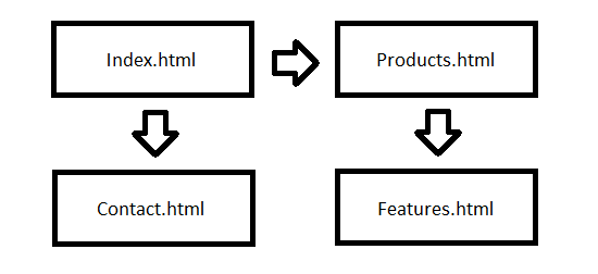
40. Creating a visual sitemap before you start building the website can do wonders for your core structure. If you know what pages you may need initially, you can plan the content ahead.41. Certain types of websites require certain types of documents. Most portfolio websites, for example, have a contact page. Seek other likeminded websites to get required page ideas.
42. When in doubt, always do what works and the norm. There’s a reason why certain types of websites succeed. It’s because they follow conventional practices that visitors will adapt to quickly.
43. Concept sketches are useful for developing your ideas. Sometimes a piece of paper or a napkin with some doodles can assist you in turning what’s in your mind into a workable design.
44. Wireframes are a simple, underused method of planning and plotting out an idea. You can create something as simple as basic shapes, right down to mapping out your site structure.
45. Beyond wireframes, you could also consider a working prototype when planning your site. Mocking up a quick and simple website can eliminate potential feature flaws quickly and easily.
46. Brainstorming is another fantastic but underused method to evolve your business or website ideas. Picking a loose concept and mapping related ideas to it can give quick but abstract results.
47. Some site owners write a business plan to scope out a project’s evolution before it happens. If you find yourself too easily distracted, it might prove to be a useful document to make.
48. Determine what kind of person you are, and the way you use websites. It’s quite subjective, but provides a good grounding point in conceptualising how an idea can become a real product.
Miscellaneous
49. Products like EverNote or Microsoft OneNote provide you with a great platform to gather and store research and ideas. Think of it like a sketchbook you can turn to for inspiration.50. Never give up. It’s so easy to think an idea has fallen flat, and most people tend to move on far too quickly. Most ideas can become what they’re intended to be with enough hard work.
Content Creation
 Even something as simple as an About page should have purposeful content produced.
Everyone keeps reiterating the same term over and over: "Content is king" has almost become a mantra which writers of web copy sing from the rooftops. And they’re right to do so!
Whether your content is provided in textual form, vivid imagery or some beautifully implemented audio and video media, ensuring your website’s content is up-to-scratch will help you turn visitors into customers.
When you come to producing the content that will help visitors understand what the website is about, the following tips may give you some relevant advice to keeping your users hooked.
51. There is more to content than text. Providing polls, infographics, or interactive elements that have content-based value can help improve the interest and readability of on-page information.
52. People respond to engaging prose.
Copyright, Content Licensing and Legalities
53. If you’re intending to build for other people, ensure you have some good solid contracts to work from. You don’t want to be unprepared if the client refuses to meet their obligations.54. Creating paperwork such as invoices, receipts of purchase, questionnaires (for contract work) and other useful materials will reduce your workload if you start doing freelance jobs.
55. Word of mouth constitutes a binding contract, though it’s harder to prove you shouldn’t say you can or will do something unless you fully intend to follow through what you state.
56. All services should have good terms of service, privacy policy and copyright agreements. It’s important that your end-users know what you expect from them (and that works in reverse)!
57. You don’t need to have a copyright statement on your website (though it’s good as a reference). Ignorance of intellectual property does not qualify as a valid excuse.
58. When deciding how to license your finished design, you may want to check out creative commons or open source licenses; they’re pre-written and flexible (which is great).
59. A cheap way of writing agreements or contracts for your website is to examine others and then write your own based on it. You can save yourself a lot of money in potential legal fees.
60. Avoid legal jargon whenever possible and simply state outright what you want to say in an agreement. Your clients will be more likely to read what you say if they can understand it,
61. If you write your own contracts, it might pay to have them read over by a lawyer to get them as watertight as possible. Verifying is often cheaper than having it custom written.
62. Accessibility statements aren’t as important as they used to be (as being natively accessible is more of a requirement), but providing one may be useful to your website’s audience.
Content Formats and Considerations
63. Get the hang of compression — whether it’s using GZIP for content, caching for external files or squeezing extra bytes from images and media. It will increase the speed of your website.64. Consider the best image format for what you are trying to achieve, while GIF makes for good basic animations, JPEG or its less lossy friend PNG will be better for high-resolution photos. Read The Comprehensive Guide to Saving Images for the Web for more information.
65. Be careful as to what you use images to portray. Not everyone can see images (like search engines) and this may present readability problems if you use them in place of text.
66. When adding video, audio or graphics into your site, make sure alternative content is available for those who cannot take advantage of these mediums due to accessibility issues.
Images
67. Opacity in images is a tricky issue with Internet Explorer. There are fixes for issues in IE6, but you should remember that only full alpha transparency has issues, not single colors.68. Your logo is one of the most important aspects of your website as it’s what people will recognise you for. Therefore, it pays to have a good, memorable one created for your brand.
69. While the favicon is one of the smallest graphics you’re likely to encounter on a website, it provides a fantastically unique way of gaining recognition in bookmarks and social networks.
70. Producing an Apple touch icon at 57×57 pixels can be useful for users of the iPhone, iPad and iPod touch who can proudly display your site in their home screens (using web clip).
71. There are loads of sites that provide free stock images, audio and video if you’re not much of a pixel-pusher.
Content Writing
72. Even if you’re not an articulate individual, trying to ensure that your spelling and grammar are correct should be at the top of your agenda.73. If you’re at a loss for what to write, taking a break or using one of the many techniques to help remove writer’s block can prove indispensible to the content creation process. See the Content Strategy category for tips.
74. A simple way to reduce the complexity of content is to take what you have and boil it down to 50%. It may seem a lot, but reductionism can seriously help eliminate the waffle!
75. Writing your content before you start designing your website can help you better approach the coding stage as you can pick the right elements that describe your content’s value.
76. Content is king. If you sacrifice the quality of the content for the design of the website, your visitors may likely hit the back button in their browser and never return as a result.
77. Much of writing for the web is down to practice. Don’t be afraid to start off small with the likes of Twitter or forum posts before building up your credibility as a web content writer.
78. Making content fun and involving is important to being successful. While dry humourless copy might get across the point, being quirky will emote passion.
79. Never be afraid to ask for help and feedback or get colleagues to proofread what you have to say. Often, a bit of critique will help you become a better professional.
80. When linking to another website, ensure you notify the visitor of how the target site relates to the content or element of the website so they don’t end up at an undesired location.
81. Break your content down into easy to manage segments. Using unordered lists, for example, can help increase the content readability.
82. Fluff and poor quality marketing speak is unnecessary. Always keep to the point and avoid redundant technical language. We all hate junk and in the recycling bin it all belongs.
83. Ensure that what you say is factually correct. Citing references will give your words added credibility.
84. Don’t plagiarise or steal other people’s content. If you find people stealing yours, it’s worth taking the time to learn how to send DMCA takedown notices and cease and desist letters.
85. When writing content of your own, simplicity is valuable. If you can strike a balance between being informative and being overly wordy, you could avoid wasting your reader’s time.
86. Don’t span long documents over multiple pages if you can avoid it. Such practices can reduce the readability of content as readers will be forced to break their natural flow to jump pages.
87. If you’re planning on having a blog, ensure that you state if you’re reviewing something and have been paid to do so.
88. There are so many fantastic CMS solutions (i.e. WordPress). If you find less technical people are going to contribute to a site you make, they can be ideal in removing some complexity and speeding up content production.
89. Consistency is important with everything you write. Maintaining a core set of standards and values helps ensure regularity.
90. Always try to put across information in a friendly and non-aggressive tone. Being overly sarcastic or rude can lead to arguments that can degrade the value of your content.
91. Feedback can be just as important in content writing as the written material itself. Using blog comments, for example, can give entertaining and potentially informative extra reading.
92. Write for people, not search engines. Your users are more important than your Google PageRank.
93. If you plan on providing translated content for international users, nothing beats a human translator. With that said, there are some decent translation tools out there.
Multimedia Content
94. If you create a podcast for your website, a good compression-to-quality ratio is 96kbs MP3 (for voice recordings). Large file sizes are a pain, and at this level, you can save a lot of bandwidth.95. MP3 is arguably the most compatible audio format around. If you’re providing alternative formats like OGG or FLAC, then ensure an MP3 version exists for more restrictive audio players.
96. Embedding Windows Media Player or Apple QuickTime into a page may have problems if people don’t have the players installed. Flash has a higher market penetration than both.
97. Automatically playing music is a sin — it’s annoying, so don’t do it.
98. Remember that Flash-dependent components are not reliable: People with vision and hand-mobility impairments limit them in accessing a lot of Flash-based content.
99. If you are planning to provide content through email, keep subscribers’ email addresses private (don’t use the CC feature when sending out emails en masse).
100. Don’t spam or send out heavy streams of email – people hate it.
Design Elements
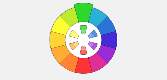 Color is a critically important part of your design as it may invoke or reflect emotion.
One of the most subjective parts of creating a website is its design. Whether you’re looking at accessibility, usability, the user experience, or even something as fundamental as the psychology of color, giving your users the best possible experience with as little effort as possible can prove tricky.
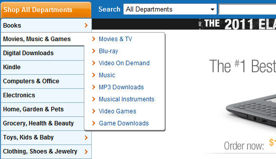
101. Your web design does not need to be pixel perfect. Every device, platform and browser render things slightly differently but that’s not always a bad thing if your site’s still usable.
102. If you are requesting users to sign up for a service on your website, always keep the amount of required information to a bare minimum. Keep things simple.
103. Keeping file sizes as small as possible is important for improved page response times.
104. Mobile web designs should be simple. If you have less content, no Flash dependence, a single column layout and a liquid design, you should have few problems with visibility.
105. mobiForge has an excellent mobile web development guide that is full of best practices and some useful guidelines to helping make the mobile experience better for your end-users.
106. Don’t rely on fixed-width designs. Toolbars, sidebars, add-ins, viewport sizes, window sizes, screen resolutions and many other factors can affect the amount of real estate available to users.
Colors
107. Color can invoke a wide range of subtle psychological influences over people. Knowing how to use color and various contrasts may help you better engage with your audience.108. Consider how people associate color with feelings: red for hot, blue for cold, white with purity and clarity, black with darkness and death, yellow with happiness and sunshine, etc.
109. Contrast is important when using colors. For certain people like the color-blind, the ability to distinguish various shades may be diminished and they may struggle to read content.
110. The idea of web-safe colors is relatively redundant due to the way screens have evolved, but making sure your site is color accessible for visual impairments is worthy of your consideration.
111. Color theory and harmony are important parts of design. Understanding how such devices influence the way information is perceived is worth studying.
Typography
112. Typography is an ever-increasing variable of importance within web design. As the range of fonts that can be used within designs increases, the legibility of those fonts becomes vital.113. Producing a font stack is easy! Have your chosen font followed by an alternative that looks similar, then its closest relation that’s likely to be available, and finally the type (like serif).
114. Size is another variable of typography within design that you should consider. The larger the scale, the more readable it becomes and the increased attention it will receive.
115. Giving emphasis through styled italics, strength through bold visual styles or underlying and striking through content can affect the perceived importance design elements receives.
Arranging Design Elements
116. White space/negative space is a valuable commodity. Don’t pack your design full of stuff! Having enough breathing space will improve the readability of your design and help the reader "scan."117. Scanning is the act of an end-user flicking through content on your pages to determine the information they are looking for. The ease they can do this will affect how they use your site.
118. Websafe typography is a big deal unless you embed a font (which has legal implications). You can’t guarantee the end-user will have any font installed, even common ones like Arial.
119. Organising your information on-screen can be a tricky task. Using conventions and patterns like the logo appearing in the top-left hand side can improve the ease of use for visitors.
120. Knowing how to appropriately display content like navigation menus is an art form and a science. Seeing how others implement such devices can help measure success rates; check out the site called Pattern Tap for common design patterns such as site navigation.
121. Remember that most people read content in a left-to-right manner. Therefore, it makes sense to have important details as high and as far to the left as possible in your design.
End-User Considerations
122. Your design should directly reflect the needs of the end-user. Don’t pack it with useless features and widgets like clocks or weather applets. Only give them what they need, as they need it.123. When updating your website (which you should do often), check your website statistics to see how people navigate around your website. It can be helpful to find where issues occur.
124. Understanding how people perceive and respond to your brand can be the difference between trust and abandonment. Your visitor’s views are more important than your own.
125. I’ve noted it earlier, but it’s worth reinforcing: update your website often! People gauge the prevalence and accuracy of websites by the rate at which they are maintained.
126. If you have the time, consider reading about psychology and sociology topics. They’re not strictly dedicated for the web, but they apply in so many regions of the industry that it’s worth learning about.
127. Don’t design a website for yourself. As much as you may like that scrolling animated reel you just implemented, you will spend little time visiting the website compared to your audience (who matter).
128. In a websites design, people look for an experience. If you give them something positive to remember, you’ll give them satisfaction, which may result in a long-term relationship.
129. The satisfaction a user gets is directly related to the way you provide information. If the user struggles to find their way to a document, you’ll make them angry.
130. Interaction-based design is important. While static content has uses in certain situations, giving users something to explore and play with will result in a more memorable experience.
131. Unnecessary interaction should be eliminated from the project. While subtle or useful enhancements are great for the end-user, added barriers may cause a user to abandon ship.
132. Applications tend to follow different rules to conventional content distribution. A need for logical structure and purpose will be of increased importance within the user interface.
133. If developing apps for a mobile device, it may prove useful to attempt an offline version for when Internet access is not an option. Dead zones for cell phone signals still exist.
Web Accessibility
134. Accessibility is an important aspect of any web design. If certain people can’t access the site or the content, that’s a group of people who you could have converted to a customer.135. Numbers in relation to accessibility are highly biased. Don’t think of people with disabilities as a minority; just think of how many people need glasses for reading — that’s a major one!
136. Impairments come in all shapes and sizes: they can be physical, intellectual, emotional, social or even technological (e.g. people without broadband connections or people using mobile devices as their browser agent).
137. The scale and duration of disabilities differ: someone may be paralysed (which would be long-term) or they may have a broken arm (short term). Don’t just think of lifelong issues.
138. There are plenty of helpful specifications and laws in relation to accessibility. Have a read through WCAG 1 and 2, Section 508, PAS 78 and the Six Revisions guide on quick web accessibility tips, to name a few accessibility guidelines and best practices resources.
139. Always provide alternative content for images or media and don’t rely on
<img> elements without alt attributes or Flash content without text variants. You’re hurting some of your visitors.140. Checking your work in a screen reader is quite easy to do. There are free tools out there such as WebAnywhere, a browser-based screen reader simulator, as well as commercial alternatives like JAWS that you can install and test your website through.
141. Don’t become too reliant on tools like Cynthia as accessibility validators because these tools only examine machine-readable code. They’re not perfect solutions for checking your design, semantic structure, content flow, and visual elements of accessibility. Read more about the problems with website validation services.
Usability
142. Usability.gov has a selection of great guidelines in PDF format that can help you improve a website for your end-users. These PDFs are well worth reading through to see what they can offer in your design process.143. Steve Krug and Jakob Nielsen are two highly respected experts in the field of usability. If you pick up books they have written, you’ll find lots of fantastic usability guides in them.
144. Usability is about making a website as seamless and functional for the end-user as possible. Do whatever you can to help users find and accomplish what they set out to achieve.
145. Before you launch a website to the general public, it’s worth getting a group of people together to test out your design and find any bugs which exist in the system and to see how usable your design is.
146. Carrying out a usability study can be as simple as asking a group of visitors to carry out a specific task and getting their feedback in the form of a questionnaire to improve upon.
147. Ensure your design degrades gracefully to create a usable design that is as universally designed as possible.
148. Progressive enhancement should be what you aim for. Simply put: you want to make sure everything can be used at a core level, and increase functionally for devices that can cope. A scenario would be using CSS3: make sure that your design still works and looks decent on browsers that don’t yet support CSS3.
149. Encourage people to get involved in helping improve your design. Ask for useful critiques and feedback that can give you future website evolution ideas.
150. Keep striving for perfection. It’s probably not possible to have a perfect web design, but if you always aim for the best, it’ll encourage you to continue making an effort in maintenance.
source: http://sixrevisions.com/web_design/250-quick-web-design-tips-part-1/


 Creating
a fresh website can be quite a difficult task if you are not really
knowledgeable as well as competent in it. If you are considering of
putting up a website or perhaps you would want the your old site
upgraded, you must look for the right people to do the job and the right
people must be coming from the best web design company. Today, a web designer
can be found all over the globe, and they can be reached through
internet so there is no problem getting the best at a good price.
Professionals are expected to deliver an excellent work and can provide
the necessary assistance whenever needed because that is part of the
package you will be paying them for.
Creating
a fresh website can be quite a difficult task if you are not really
knowledgeable as well as competent in it. If you are considering of
putting up a website or perhaps you would want the your old site
upgraded, you must look for the right people to do the job and the right
people must be coming from the best web design company. Today, a web designer
can be found all over the globe, and they can be reached through
internet so there is no problem getting the best at a good price.
Professionals are expected to deliver an excellent work and can provide
the necessary assistance whenever needed because that is part of the
package you will be paying them for.
