Thursday 28 March 2013

7 Basic Web Design Tips for 2013

7 Basic Web Design Tips for 2013

coffee
All of us are familiar with the fact that technology has never been the same since its inception, it has been constantly evolving time and again. Being a web designer, you should always thrive to improve the quality of the websites you build, before any new technology makes its advent in the market. When we look back at the web pages around 5 years back and websites these days we sure do find remarkable progress. These days’ websites concentrate more on making its looks very stylish and its usability. It is absolutely not an easy task to predict the trends in web designs where the industry is constantly progressing within the twinkling of an eye. We will take a look at some of the trends which will prove to be beneficial to you.
  1. Layouts which are highly responsive: Layouts must be designed in a way where they support and match all the digital media forms. This means they should support every kind of smartphone, laptop, desktop, tablets or any other similar releases in the future. This can be thought of like a single unique set of codes which runs on any platform and suits any environment. If you have a larger window to browse you can add brilliant illustrations to the layout thereby making your website responsive.
  1. Vertical Scrolling: This has proved to be the most efficient way of navigating through a web page when compared to other processes of scrolling. You can use you creativity and make use this technique and make your website still looking elegant and distinct from the rest.
  1. Beautiful Typography: Choosing an appropriate typography for any website is a pivotal task for a designer. You should make a clever selection of the fonts you choose for your site. Choose the one which is elegant and understandable to your visitors and to you.
  1. Retina Display: If you want to lure your visitors to your website then this is it!. Apple Inc. brought this into existence right from their iPhone 4 release and have been applying to their other devices ever since. The retina screens are twice denser than the LCD which means that the same number of physical pixels which are digitally twice can be fitted into the same physical space which gives you a website which is pixel perfect.
  1. Brand Promotion: Every business wants its brand to be noticed within a jiffy and to stand out from the crowd. This year apart from merely designing websites, web designers will surely concentrate on branding the image of the company.
  1. Unique Relevant Content: Always have something unique and interesting to offer in your site. At the same time ensure the words you use are search engine friendly. Content is not about your company, it is about how your visitors can benefit from it. It is absolutely not “We take our pride in the services we offer”, it is “Here is how you can improve your life by using our services”.
  1. Limited usage of text: Instead of using plain text which are too long where people end up getting bored and sometimes won’t even read it, why don’t you break up your text using headings, bullets, sub-headings and various text devices to lead the users to important information.
source:http://dronade.com/7-web-design-2013/

Monday 25 March 2013

Web design trends for 2013

Predicting the future is always a risky venture, and there is no precise method that allows you to define the future trends of web design. But… we can try. ;)
We’ve determined the directions of web design based on our observation of what types of design solutions are gaining popularity. Many web design trends occur due to changes in: technology, market, fashion, pop culture and art. But first, let’s take a quick look back at 2012 and see what trends are on the rise.

Signs of the times in 2012

Last year was important, perhaps even a turning point, for web designers. A few key points of interest in 2012 were:
  1. Mobile devices with Internet increases: This trend has been present for years but statistics from 2012 show it’s at an all time high, which makes it extremely important to take into account while designing for web.
  2. Enormous screen resolutions: The iPad 3, as well as other mobile devices, were released and with these come enormous screen resolutions.
  3. Improving HTML/CSS: There have been improvements in features such as HTML5, CSS3 and web-safe fonts in browsers.
  4. Release of Windows 8, with it’s metro interface: Despite sluggish sales of the new Windows operating system, the metro interface changes the way of thinking about software interfaces. It is moving away from the standard window with a title bar and navigation at the top.
  5. Navigation within 1-page: Navigating within 1 dynamic page is replacing navigation from page to page. Over the last year, we saw many websites with this type of solution. For example, Facebook’s traditional layout was replaced by a timeline with infinite scrolling that makes users feel like they’re moving back in time.
So, what can we expect to see in 2013? Make sure to share what you think in the comments!

1. Responsive web design (RWD) goes mainstream

Due to the unprecedented rise in the use of mobile devices, we are seeing a flood of websites that are designed to work on both desktops and phones. Designers are finding more and more the need to create designs that work on different screen widths, whether it’s 320 pixels or 2500 pixels. We can thank the use of multiple devices and RWD for this abandonment of the standard width.
With the flexibility of RWD, it’s not surprising it’s being quickly adopted into mainstream sites like the news.

The Boston Globe is a newspaper that can be adjusted to fit any screen size, which makes it easier to carry right in your back pocket. :)
You can find more RWD design examples in my last post, Responsive web design: key tips and approaches.

2. HTML5 and JavaScript replace Flash

The quest for a rich user experience is nothing new. The term RIA (Rich Internet Application) was first used in 2001 by Macromedia (now part of Adobe) to describe websites made entirely in Flash. In 2005, Adobe and Maromedia announced that Flash was supposed to be the multimedia publishing platform for all devices. Steve Jobs disagreed and Apple never officially supported Flash. Today, Steve Jobs would be proud to hear Flash is dying (or maybe is already dead).
Many web designers have lived through the rise and fall of websites built with Adobe Flash. Now we must approach these same design issues the new way — replacing Flash with HTML5, CSS3, Javascript, Canvas, etc.
You can see Google is adopting the latest technologies by their investment in Chrome. Chrome is really pushing the internet forward with awesome sites like Chrome Experiments — you have to check these experiments out! We at 99designs can’t wait to see what the future holds for websites supported by these browsers.
ChromeExperiments
Find Your Way to Oz is an awesome example (out of many) from Chrome Experiments. What are some of your favorite Chrome Experiments?

3. Websites give a cinematic and storytelling experience

Thanks to responsive web design, which allows designs to convert to screens of any size, designers are creating websites that give the feeling of being in front of a movie screen. We are seeing websites that use little text with big photos and videos (photo and videos that sometimes cover the screen entirely).

Cadillac’s ATS vs. The World uses a huge image of a rotating earth, which gives a nice cinematic feel. If only they incorporated this type of style throughout the rest of their site.
Another example of a cinematic experience can be found on digital agency site, Welikesmall. Although this site has a lot going on, it does a good job at using small fonts and eye-catching photos.
Similarly to this cinematic experience, we are seeing websites that integrate storytelling:

The Story of Jess & Russ unfolds a love story of the couple as users scroll. Just looking at this site once, you might feel like you’ve been there sharing their journey all along.
Want more storytelling? Check out Impress A Penguin who cleverly uses storytelling to find a new Community Manager for their company. Or the site promoting the film, Skin Color: Honey which has viewers explore the website as the young boy Jung — a great, interactive way to get any interested moviegoer engaged.

4. Creative navigations replace traditional navigations

One thing you might have noticed while looking at the examples of cinematic and storytelling sites is how some are straying from the traditional top navigation bar. User-experience is shifting from a clear hierarchical navigation to a rich user experience with the use of full-screen photographs, videos, interactive elements and animation.
Website navigations usually consist of links set in a menu bar with the viewer clicking through, and scrolling down each page. Now, we are seeing very sophisticated navigations — main menus are being reduced, sometimes disappearing completely or sliding behind screen edges.
In some cases, when a viewer scrolls they aren’t moving down a page, but are remaining on the same page and seeing different graphics enter the screen.

Here are examples of creative navigations we might be seeing more of in 2013:

Bagigia is an interesting example of a product site that gives viewers a unique experience by making it feel like they are getting to play, flip and rotate the hand bag. The navigation bar is hidden so nothing distracts the user’s attention from the product. The viewer can navigate via the zipper graphic or on the right side of the site.
BOND
BOND uses a fascinating concept of navigating through time starting from 1962 (seems a bit storytelling to me). When you begin scrolling you move into the O of the word BOND and, as you scroll, are faced with different cars, colors and screens — it feels as if you’re traveling from the past to the present. Check it out if you haven’t, this site is really well done!

The first thing you’ll notice about The Production Kitchen is it’s chock-full of incredibly detailed and charming illustrations. It’s like a map where you have to drag (not scroll) to explore each section. Again, there is a navigation bar added to the bottom, just in case the viewer doesn’t have time to explore (trust us, you should make time).

5. Websites incorporate parallax effects

When there is really no story to tell, some websites choose to imitate camera movement with parallax effect. Parallax creates an illusion of depth by making elements (layers) of a web page move at different speeds as viewers scroll.
I’ll give an example to help visualize this: When your driving, the trees surrounding the road seem to move by your car quicker than say, a house you’re coming up on in the distance. Simulating this visual effect on a monitor screen provides for an engaging user experience. This effect has been known for some time, but is being used more and more in web designs.

Spotify — an awesome music site that allows you to build your own playlists — uses parallax effect as the viewer scrolls down the page.

Zuelements also plays around with this effect (although it’s more subtle).

6. Web designs inspired by Swiss design style

Swiss design style, or the International Typographic Style, has been inspiring designers since the 1950s. Swiss design style features typography as the primary design element, and favors sans-serif typefaces, grids and asymmetrical layouts. Fathers of this style focused on simplicity, legibility and objectivity.
Recently, this style has shined in a new light with Windows 8 interface release. This idea of using grids and grid-based typography is gaining even more attention.

Microsoft’s website is based on the Swiss UI design style — grid-based, white space, flat colors and big letters. It’s worth noting that Microsoft’s website navigation is more traditional than their Windows 8 interface. It’s also important to note how Windows 8 is designed for touch, not just pointing and clicking. Will we be seeing more and more designs created for touch screen?
Here are other examples of websites that use Swiss design style:

Daniel Vane.com does a great job at implementing a fullscreen square grid layout, which are becoming more popular.

Buffalo also does a great job at demonstrating this idea of grid-based, white space, flat colors and big letters. They also show how a hexagon grid is possible.

Conclusion

Now it’s your turn to make predictions on the trends we’ll be seeing in web design over the next year. It’s clear, we are seeing more responsive web designs, designs that integrate storytelling and site’s that integrate creative ways for viewers to interactive within a page. This certainly changes design workflow and brings new, exciting challenges for all web designers.
source: http://99designs.com/designer-blog/2013/02/21/web-design-trends-for-2013/

Thursday 21 March 2013

Custom Website Design Vs. Template Vs. Build Your own via Software

Tulsa Website Design)

Custom Website Design is a great way to go if you want the best of the best. You'll be spending a lot more than the other two ways but it's going to look and function a lot better. If you choose to go this route, make sure you choose the right design company. Look around at their portfolio and visit the sites they claim they designed. Call up some of those sites if you can and talk to the owner to verify that the design company did indeed create the site. Ask how his / her experience was with the company. If you're going to spend a lot of money, do your research first. Some company's claim to do custom web designs but only edit templates or worse. Let's recap on the pros and cons!

Pros:
  • Great looking design and functionality
  • One of a kind
  • You will be working with a team of experts
  • Can basically have the website do anything you wish
Cons:
  • Can leave your wallet very light
  • Can take a month or maybe two to finish
  • Some company's lie about being a Custom Website Design firm so do your research
Template buying is a popular was to get your website started also. There are many sites that offer thousands of templates and decent prices like template monster. The average price of a template will run you around $50. Buying a template is one of the cheapest ways to get your website up and running but there are a few things to keep in mind. Hundreds of people may have bought the same template as you so you might have a lot of websites looking the same. If you don't know how to edit a template or even upload it to your hosting server properly, you will be paying someone to do it for you.

Pros:
  • Cheap way to get a fully functional website
  • Can have it up and running within hours if you know what you're doing
  • Thousands of different templates to choose from

Cons:
  • Lots of other people may have bought that same template so you may have hundreds of other websites looking just like yours
  • If you don't know how to edit websites or upload them, you will be paying someone to do it for you.
Some websites have software that you can use to build your own website like homestead. They charge you a small monthly fee, usually about $10 a month and you can build your own website and host it through them. In theory this is a good idea but from my experience people don't stick with it very long. The software is pretty simple once you get use to it, most of it is just drag and drop. If you're looking for a nice flashy, functional, unique website this is not the place to go. Websites using these types of software are basic with not a whole lot of functionality to them. You just can't get the perfection that you get with a team of expert website designers and developers.

Pros:
  • Cheap price of $10 per month
  • Can build and edit the website yourself
  • Easy to drag and drop
Cons:
  • Most website using this type of software come out looking "Basic" and "Dull"
  • Can get annoying with its limited abilities
  • Most people that use this will end up hiring a designer to build them a website
After looking at these three items, which is the best way to go you ask? Short answer, there isn't a best way. You will have to take in the pros and cons and figure out what is best for you and your current situation. I hope this helps!

Created by Vivid Custom Websites
www.vividcustomwebsites.com
source : 

Sunday 17 March 2013

Web Design: 20 Hottest Trends To Watch Out For in 2013

All throughout 2012 there has been an enormous surge in new web design trends. Some of you may remember my earlier post on web design trends going into 2012. Now we can see many of these ideas have come to fruition, and even adopted further increasing levels of novelty. In this article I would like to delve into 20 more design trends for the new 2013 year.
The design influence is merely a reflection of our culture and expectations for user interfaces. Ideally these trends represent favorable ideas in the web design community. However designers will always have their own opinions when it comes to design terms, so take these ideas with a grain of salt.
If you are interested, keep your eyes peeled for examples of these trends and techniques.

1. Responsive Layouts

This topic was my first point in the 2012 trend article, however I feel that responsive web design has been changing to ultimately come to a threshold where layouts are designed to match all forms of digital media. The idea is to support all devices from laptops, desktops, smartphones, tablets, and anything released in the future.

(Image Source: Chris Jennings)
You could think of this trend more like a uniform web design where the goal is to have a single set of codes which run perfectly on all environments. Responsive websites are often thought to cater towards mobile browsers, but that isn’t the sole purpose.
You can have a responsive website which also adds brilliant illustrations and graphics into the layout when the browser window is larger.
The big idea here is to think about website design as a single canvas which is dynamic and fluid by nature. CSS3 media queries allow developers to customize layouts based on limited or expanded screen real estate. Use this to your advantage and see how other designers are using it as well!

2. Retina Support

Along with responsive support for website layouts I have also seen a dramatic rise in people building for retina devices. Apple first engineered this idea with the iPhone 4 and has since applied this screen display onto their other devices, including the iPad and some MacBooks.
Retina.js JavaScript library open source
Retina screens are basically twice as dense as any average LCD. So they are the same number of physical pixels, but digitally twice as many pixels can be fitted into the same physical space.
This means pixel-perfect web designers supporting retina devices will need to create two sets of http://media02.hongkiat.com/web-design-trend-2013/. First you need to sample your image at double the resolution, then save a “standard” version at half the size. The larger image will be scaled down to the standard resolution and will look very crisp on retina screens.
One of my favorite tools for responsive web design is retina.js. This is a JavaScript library for automatically displaying @2x retina copies of image whenever your user is browsing on a retina device.
Although this won’t detect CSS background image, it is still the most handy resource as opposed to coding everything in media queries.

3. Fixed Header Bars

Using the CSS position: fixed; property is a great way to staple a header bar onto your website. As visitors scroll down your page this will offer constant support for navigation and a trip back to the home page. This trend has been around for a while but now we are seeing this in full force.
Trilulilu fixed top navigation bar website social network
Fixed headers are so interesting because they can work on practically any website. This includes social networks, blogs, and even design studios or private companies. The design is very trendy and looks great paired with most layouts. But aside from the aesthetics, this bar also provides an exceptional user experience without needing to look very far to navigate the website.

4. Large Photo Backgrounds

Photographers or even fans of photography will definitely enjoy this design trend. I have seen countless showcases discussing the ideas of big oversized photography in the background. It’s an excellent way to capture your visitor’s attention and it can look great when done properly.

(Image Source: davidia-int.hr)
I am often fond of big photographs since they can be pleasing on the eyes. When blended into your layout, this design technique can give your website a major edge in marketing. On this topic I always consider the ever popular design portfolio of Kerem Suer. This unique background photo behaves as custom branding for everybody who lands on his website.
Kerem Suer freelance design portfolio oversized photo background

5. CSS Transparency

The new CSS3 properties have allowed for opacity edits on any webpage element. This means you have control to generate transparency in any modern web browser – no Photoshop required! This trend of web design transparency was recently discussed on Codrops with some very enlivening talking points.
Squarespace transparent website layout css design
One excellent example is on the Squarespace Blog where the central wrapper is given a background: transparent property. Typically this can be used to generate some other background from repeating http://media02.hongkiat.com/web-design-trend-2013/, or to setup the background using internal elements.
Another interesting design technique for manipulating transparency is through rgba() color syntax. When designing in CSS you have the option of specifying colors using Red, Green, Blue, and Alpha-Transparency values. So using the syntax rgba(255,255,255,0.6) would generate the color white at only 60% opacity. This is certainly a design trend we can expect continuing into 2013 and beyond.

6. Minimalist Landing Pages

Anybody who has spent some time researching markets will understand that selling on the Internet is just plain smart. You have access to a large consumer base from anywhere in the world. Additionally you can sell products which are not even physical, such as videos or creative resources.
PictoPro website icons buy set vectors
Creating a landing page online is all about capturing new leads for your product or service. New trends are following the idea of minimalism: keep everything simple and focus on your core product.
This is exemplified on the PictoPro webpage which offers a beautiful resource for cheap icons. The page is fairly crafty using vector icons as a background effect. But all the text is easy to read and it’s basically a one-click checkout process. You cannot get much simpler than that.

7. Digital QR Codes

The abundance of mobile smartphones has led to a surge of QR Code apps. This stands for Quick Response Code and has developed from the older UPC barcodes. You will find these tagged everywhere from restaurants to event venues and automobile sales lots.
Keith Cakes Bakery contact QR code snapshot
But very recently I have found a couple of websites with these codes built right into the design. This isn’t something you would normally consider since they are often found in print. But QR codes could become trendy as data transmission becomes quicker over time. You can see a brilliant example of this technique on Keith Cakes contact page.

8. Social Media Badges

Marketing is one of the ultimate determining factors in a website’s success or failure. Social media and viral marketing are exploding in many different websites. Digg used to reign popular in this domain but has since conceded to rivals like Reddit. But these are not the only two popular resources for sharing stories online.

(Image Source: WebTreatsETC)
You can check practically any social community for sharing badges and will likely find a great solution. You can position these badges pinned to blog posts and articles anywhere in your layout. These are still used actively by readers and fans who want to share content quickly on places like Facebook, Twitter, or even LinkedIn.
Below I have put together a small list of social media badges you can try in your own website layouts.
  • StumbleUpon Badges
  • Google +1 Button
  • Pinterest Buttons
  • LinkedIn Share Badge
  • Hacker News Vote Badge
  • Dzone Vote Buttons
  • Free Social Media Icon Sets – Best Of
  • 100+ Remarkably Beautiful Twitter Icons And Buttons

9. Detailed Illustrations

Newer design trends are all about catching and holding one’s attention. I feel that illustrations perform this task brilliantly. The problem is finding a designer who can make such impeccable works of art, or even teaching yourself.

(Image Source: twogiraffes.com)
Illustrations can be used in many various ways to bring about different moods in your website. Look around the Internet, and you will find many different website galleries and showcases focusing on digital illustrations. You can see these artistic works eventually blend into its website branding almost perfectly. MailChimp is probably the most definitive example with its trademark chimp mail carrier.

10. Infinite Scrolling

Infinite scroll loading has been around for at least a few years. But this technique hadn’t really hit mainstream until this year and I’m sure it will continue into 2013.
Pinterest infinite scrolling pins homepage
Pinterest has adopted this loading technique for their layout and it works beautifully. You can search anything and the results page will continually load as you scroll down. Pagination is basically a non-issue and doesn’t even work as a detriment into the user experience. Talk about designing for simplicity!
But another great example and possibly my favorite example is on Tumblr. You can blog and reblog photos from other people you follow which all appear on your Dashboard. So after logging into your account all the most recent posts will scroll infinitely down the page.
This is an excellent technique which does not work on every layout, but for the right websites this can look and behave phenomenally.

11. Homepage Feature Tours

Sliding image presentations and demo videos are both very common with new products on the web. Landing pages and startups often try to entice potential users with these informational goodies. And they can often work very well, if you know how to construct something that looks good on a webpage.
MediaFire direct download files tour webpage layout
Looking back over 2012 I would say my favorite example of this trend is on MediaFire’s homepage. The entire top portion of the page rotates between a series of slides. They each explain what you can do on MediaFire and how their features compare with other websites.
What helps this demonstration stand out is also their use of big graphics and icons. This is another trend which will not work on all websites, only for certain products you can draw in loads of attention.

12. Sliding Webpage Panels

Dynamic websites used to be very popular when Flash and ActionScript were all the rage. Now, dynamic effects have moved into the realm of JavaScript/jQuery, and this has in turn affected the way designers build websites. Sliding panels is just one technique I happen to really enjoy and would expect to see more in 2013.
Captain Dash website layout sliding panels webpage
Right off the bat you may not think CaptainDash is any special website. But as you click through the navigation you will learn that each page is loaded in succession pushing from left-to-right. Dynamic effects such as these do not always bode well for mobile users.
But if you can handle them with responsive design techniques or an alternate mobile site then this is a really cool effect worth trying out.

13. Mobile Navigation Toggle

When speaking of responsive design one of the most difficult questions is how to build a solid navigation. You want to give your readers direct access to all your important links, without flooding the page making it unreadable. It is also a good idea to keep your responsive navigation hidden away until it’s needed.
Treehouse Blog responsive mobile navigation menu links
Enter this beautiful design trend of mobile navigation toggle menus. The Treehouse Blog is merely one example of this technique which looks brilliant on your smartphone. And even in your web browser! But there are dozens of websites and design studios who have adopted this trend for their own responsive layouts.
What I like most about the toggled navigation is that you can design menus in so many various forms. You can have links drop down from the top, or slide down, or push content over from the left or right side. Designers have so many options to play with and there is plenty of time for UI experiments.

14. Fullscreen Typography

Earlier I mentioned using big oversized photographs in the background of website layouts. This trend can be extended to focus on typography as well: designing your webpage text so it fills the entirety of the browser. Some users may find this annoying. But this is not often the case if the layout is fitted perfectly for super-large text.
Alex Pierce website typography oversized text
Alex Pierce has a great website layout which does focus deeply on typography. You can see this includes rich text effects using CSS3 properties. Additionally the website is very easy to navigate, and many of the other page elements appear oversized as well.
Big text with unique font styles can stand out just as much as oversized photography. And I am sure this will see more design critiques moving into the new year.

15. APIs and Open Source

Open source software has been around for decades and has been changing the web since its inception. But over the course of 2012 I have noticed more open source software pertaining to webpage widgets, layouts, and dynamic effects. Typically we could also be talking about free website templates, layouts, or CMS software such as WordPress.
social networking open source programming code development
Open APIs and resources like Github allow designers to not only prototype layouts, but also animations and effects on the page. jQuery has a practically uncountable number of plugins for free download to be found all over the Web.
And I am honestly not expecting the amount of open source projects to slow down anytime soon. This truly is the greatest era to be getting started and advancing your knowledge in the field of creating websites.

16. Deep Box Shadows

I discussed CSS3 box shadows in our previous post written for 2012, and this trend has proven to be very accurate. In fact, I now almost always expect to see box shadows infused with elements in modern web designs. The effects look amazing and they rarely detract from the aesthetics except when overused.

(Image Source: rareview.com)
I believe the problems that designers had to face years ago stemmed from box shadows being too difficult to implement. Back a few years, this effect would require some type of JavaScript or direct background http://media02.hongkiat.com/web-design-trend-2013/ created in Photoshop. Now box shadows can be generated with a few lines in CSS.
I would look out for new box shadow techniques all throughout 2013. I think the trend is already deeply ingrained into the design community, now it is more about who can be the most creative!

17. CSS3 Animations

The CSS3 transition property and all the related browser prefixes offers CSS dynamic effects just like JavaScript. Designers can now animate effects on the page based on different CSS properties. I have seen a lot of nice hover effects and form input fields using these transitions the right way.
Codrops tutorial css3 animation transition effects
Another excellent and very inspiring example comes from a CSS alerts tutorial on Codrops. Notice how you can setup various times and settings for the animations.
This is definitely a trend which offers some promise in the coming months and years with lots of room to advance. I am confident that newer web designers will give rise to booming animations all created without the use of scripting.

18. Vertical Navigation

I was not a big fan of this layout style when I first started noticing different websites adopting this trend. However over this past year I have seen more designers creating elegant solutions with the vertical rhythm still intact. And when done properly, vertical website layouts can be affluent with content and design taste.
Riot Industries vertical navigation menu links website layout
The portfolio on Riot Industries is a great example for newer web designers. Check out how the navigation links work and how the portfolio entries are dynamic on hover effects. Also the border textures really show a dividing line between the left and right columns.
This textured effect is apparent in other vertical layouts as well, such as the CSS gallery Design Bombs.
DesignBombs css website layout gallery vertical links

19. Single-Page Web Design

Single page design is a big topic and covered under many different categories. Obviously there have been single-page websites since the creation of the World Wide Web. But over the recent years we have seen this trend evolve to sport a more natural user experience.
Cage App website single page layout design
I think the website design for Cage App is possibly one great example of many trends listed in this article. They are utilizing a single-page layout brilliantly with content split up by horizontal containers. But you will also notice the very top of the page features a blurred background photo effect.
Plus as you scroll down the page, the navigation bar actually stays fixed at the top of your window. Incorporating other popular design trends into a single-page layout is one solution for drawing attention from visitors and making one captivating website design.

20. Circular Design Elements

The trend of circles within website layouts is something newer and has been given a lot of attention recently. Designers like circles because they are clean, neat, and generally fit into any layout block. You can build patterns and even fix your page elements into circular designs (eg. user avatars, share buttons, post dates, etc).
Lucia Soto freelance design portfolio circular website designs
The portfolio of Lucia Soto is basically one terrific example of circular web design. The website is built dynamically so you are panning horizontally to different segments in the page. You will notice some cute vector artwork dotted along the sidelines as well. Web designers crave these extra tidbits in page layouts because they ooze uniqueness.

source:
http://www.hongkiat.com/blog/web-design-trend-2013/
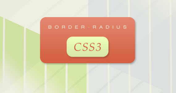
Thursday 7 March 2013

33 Must Read CSS3 Tips, Tricks, Tutorial Sites and Articles


  • 8
  •  43
%tutkeSince previous article about CSS text effects got really big attention I decided to research and find more interesting articles and websites just focused on CSS3, teaching you how to use it, showing pros and cons and much more. To be honest it’s hard for me to keep up with technologies myself, but we really cannot not to use those new great selectors to make our designs even more beautiful, user-friendly and lightweighted. However since HTML5 is sort of tied with CSS3, I will soon continue with HTML5 article as well, so don’t miss it and keep coming back! Enjoy!
%tutke

1. Take Your Design To The Next Level With CSS3

In this article you’ll learn why CSS3 should be used and how web designers use it already in good way. Great article for getting you started with CSS3.
next-level-sm-css3-useful-webdev-webdesign-resources

2. Push Your Web Design Into The Future With CSS3

Here are five CSS3 techniques snatched from the future that you can put into practice in your website designs today.
future-sm-css3-useful-webdev-webdesign-resources

3. Super Awesome Buttons with CSS3 and RGBA

Learn how to create super cool, scalable buttons with CSS3.
buttons-css3-useful-webdev-webdesign-resources
View Demo

4. A Look at Some of the New Selectors Introduced in CSS3

selectors-css3-useful-webdev-webdesign-resources

5. CSS 3 Cheat Sheet (PDF)

This is printable CSS 3 Cheat Sheet (PDF), a complete listing of all the properties, selectors types and allowed values in the current CSS 3 specification from the W3C. Each property is provided in a section that attempts to match it with the section (module) that it is most actively associated within the W3C specification.(Download *pdf)
cheat-sheet-css3-useful-webdev-webdesign-resources

6. CSS3.Info

CSS3 is the new kid in the stylesheet family. It offers exciting new possibilities to create an impact with your designs, allows you to use more diverse style sheets for a variety of occasions and lots more. Also check excellent CSS3 Preview page there, which shows demos of new features.
info-all-css3-useful-webdev-webdesign-resources

7. Get Started with CSS 3

Beautiful CSS3 tutorial article explaining several new CSS3 features and giving solutions how to create them actually.
webmonkey-css3-useful-webdev-webdesign-resources

8. Introduction to CSS3 – Part 1: What Is It?

These six part series are providing an introduction to the new CSS3 standard which is set to take over from CSS2 from DesignShack.
designshack-css3-useful-webdev-webdesign-resources

9. Accessibility Features of CSS from W3

This document summarizes the features of the Cascading Style Sheets (CSS), level 2 Recommendation ([CSS2]) known to directly affect the accessibility of Web documents. Some of the accessibility features described in this document were available in CSS1 ([CSS1]) as well. This document has been written so that other documents may refer in a consistent manner to the accessibility features of CSS.
w3-css3-useful-webdev-webdesign-resources

10. Progressive Enhancement with CSS 3: A better experience for modern browsers

In this article you will look at how you can use graceful (or, progressive) enhancement techniques to make use of CSS3 features in browsers that support them, while ensuring that your code will still provide a satisfactory user experience in older browsers that do not yet support those features.

11. Conversation with CSS 3 team

In this article, xhtml.com interviews Bert Bos, chair of the CSS Working Group at W3C, about the next release of the CSS specification and how past design decisions are influencing the future of CSS. This interview offers a rare opportunity to learn more about the inner workings and thought processes of the CSS Working Group at W3C.
conversation-css3-useful-webdev-webdesign-resources

12. Six Questions: Eric Meyer on CSS3

Great interview with Eric Meyer about CSS3.
eric-meyer-css3-useful-webdev-webdesign-resources

13. The fundamental problems with CSS3

This article brings up several problems and issues with CSS3, interesting reading.
problems-css3-useful-webdev-webdesign-resources

14. CSS3 Exciting Functions and Features: 30+ Useful Tutorials

In this post you will take a look at some interesting properties of CSS3 that you can put into practice in your website designs today.
exciting-functions-css3-useful-webdev-webdesign-resources

15. Old School Clock with CSS3 and jQuery

old-school-clock-css3-useful-webdev-webdesign-resources

16. The CSS3 border-radius property (Not Valid Anymore)

One of the CSS3 properties designers have been longing the most for is undoubtedly the border-radius property. With CSS3 border-radius property it’s possible to create the so popular rectangles with rounded corners exclusively via CSS – no images needed.
border-radius-css3-useful-webdev-webdesign-resources

17. Get the best out of CSS3

Craig Grannell turns into a cross between Jeffrey Zeldman and Russell Grant, taking a peek at what the future of CSS has to offer – with a little help from Opera, Safari and Firefox
craig-grannell-css3-useful-webdev-webdesign-resources

18. How To Create A Sexy Vertical Sliding Panel Using jQuery And CSS3

sliding-jquery-css3-useful-webdev-webdesign-resources
View Demo

19. Rounded Corner Boxes the CSS3 Way

rounded-css3-useful-webdev-webdesign-resources

20. #57: Using CSS3 by Chris Coyier

This screencast covers many of CSS3 techniques now possible, focusing on the ones that can be used for progressive visual enhancement. Border radius, @font-face, animations/transitions, text-shadow, box-shadow, multiple backgrounds, RGBa, gradients, border image.
chris-coyier-css3-useful-webdev-webdesign-resources

21. HTML 5 and CSS 3: The Techniques You’ll Soon Be Using

In this tutorial, your are going to build a blog page using next-generation techniques from HTML 5 and CSS 3. The tutorial aims to demonstrate how we will be building websites when the specifications are finalized and the browser vendors have implemented them.
layout-html5-css3-useful-webdev-webdesign-resources
View Demo

22. 11 Classic CSS Techniques Made Simple with CSS3

In this tutorial from Nettuts you will learn eleven different time-consuming effects that can be achieved quite easily with CSS3.
11-simple-css3-useful-webdev-webdesign-resources

23. CSS 3 selectors explained – Overview of CSS 3 selector syntax

explained-selectors-css3-useful-webdev-webdesign-resources


24. 3 Easy and Fast CSS Techniques for Faux Image Cropping

faux-image-css3-useful-webdev-webdesign-resources

25. CSS3 Borders Preview

CSS3 takes borders to a new level with the ability to use gradients, rounded corners, shadows and border images. Mozila, Firefox and Safari 3 have implemented this function, which allows you to create round corners on box-items.
borders-css3-useful-webdev-webdesign-resources

26. CSS3 property tests

browser-support-css3-useful-webdev-webdesign-resources

27. CSS3 Background Images (Sizing & Multiple Imgs)

Background images / textures are being used and implemented in many ways, often adding the nicest of finishing touches to a website. It is now proposed that in CSS 3, we can apply background image dimensions as well as use multiple background images. Along with the +/- quick list of compatible browsers, here is how
bg-images-css3-useful-webdev-webdesign-resources

28. Overview of CSS3 Structural pseudo-classes

structural-pesudo-css3-useful-webdev-webdesign-resources

29. 5 CSS3 Techniques For Major Browsers using the Power of jQuery

techniques-css3-useful-webdev-webdesign-resources

30. jSlickmenu: A jQuery plugin for slick CSS3 menus

slick-jquery-menu-css3-useful-webdev-webdesign-resources
View Demo

31. Multiple Backgrounds (CSS3)

multiple-backgrounds-css3-useful-webdev-webdesign-resources

32. CSS: border-radius and -moz-border-radius

border-radius-moz-css3-useful-webdev-webdesign-resources

33. Modernizr

Modernizr is a small and simple JavaScript library that helps you take advantage of emerging web technologies (CSS3, HTML 5) while still maintaining a fine level of control over older browsers that may not yet support these new technologies.

source: http://www.1stwebdesigner.com/css/must-read-css3-tips-tricks-tutorial-sites/