Friday 24 May 2013

Latest 10 Web Design Trends for 2013

For starters, we’d like to say thank you for the amazing reception our free eBook Web design and Mobile Trends for 2013 has had since its launch last week, and especially to all those who made it possible by sharing their insightful opinions.
Today we’re doing a review of the end conclusions, where we will identify and analyze 10 of the key trends. This is just a brief overview of the conclusions you can read in the book. In fact, we have now released an updated version of the eBook in PDF format, which includes a few corrections and a new layout for an easier and more enjoyable reading experience.
  • What will be those key trends?

  • 1. CONTENT FIRST
  • 2. SIMPLICITY OF DESIGN INTERACTION AND CONTENT
  • 3. UX CENTERED DESIGN
  • 4. APP STYLE INTERFACES
  • 5. THE UNIFICATION OF DESKTOP AND MOBILE INTO A SINGLE VERSION
  • 6. SVG AND RESPONSIVE TECHNIQUES
  • 7. FLAT COLORS AND NO MORE SKEUOMORPHISM
  • 8. TECHNOLOGY AGNOSTIC
  • 9. EXPERIMENTATION AND INNOVATION IN DEVICE SENSORS AND INTERACTION
  • 10. THE INTERNET OF THINGS
It’s no easy task putting together a short summary of all the interviews, but as far as we’re concerned, there are a few memorable statements in the book which nicely encapsulate the conclusions we’ve come to:
Bruce Lawson:“If I go to a train website, I don't really want to see a picture of Richard Branson smiling at me, I don't want to read the Chief Exec's ambitions and life history. All I want to know is what time my train is and how much it is.”
Karen McGrane:“Mobile is not the Lite version. You don’t get to decide which device people use to visit your website. They do.”
Simon Foster:“I always keep it in mind that no matter how beautiful I make a website the average user only really wants to spend about 10 seconds on it.”
This project reveals the need to prioritize content and the user’s point of view. Almost all the participants expressed concerns about accessibility and application performance across the multiple devices that exist today and will only continue to increase in number. This wasn’t the case a few years ago, as Rachel Andrew points out:
“We were all saying ‘in a few year’s time we’re going to have massive screens and all this space and people are going to have really fast connections’ and what’s happened is we’ve all ended up on tiny little screens with crappy bandwidth.”
So years ago the tendencies would have been very different. We would have been focusing more on development of visual effects, animation etc...But the future is unknowable.
We have to reach our target users, wherever they live, whatever device or browser they use, and serve them our content in the most efficient way possible. Though this is what web standards evangelists have been shouting from the rooftops for years.
All the trends discussed here are interdependent and fundamentally defined by three principles: Content oriented, UX-centered and Simplicity, which make up the new paradigm we’ll need to work with when we come to face the deluge of devices that’s looming on the horizon.


  • 1. Content First


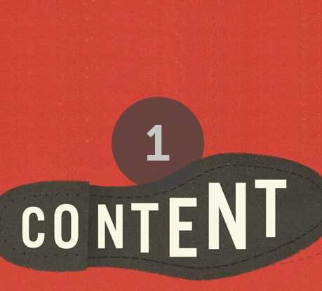
    Content-first will be the center of the galaxy. Content is the most talked-about term in the book. In the coming months we’ll see deep debate about how content should be presented to the user and whether or not we should adapt it to the device.
    In any case, this should be our main concern. We need to create efficient, searchable, accessible, multi-platform content and make sure it reaches the user via the best interactive experience possible.
  • 2. Simplicity of Design Interaction and Content


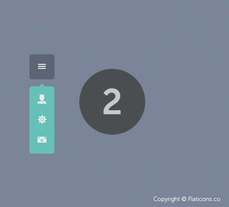
    Simplicity is the new paradigm. The process of simplification will be the only tool we have to make content accessible and readable on the greatest possible number of devices, with the best user experience. Content strategy, UX, Usability, Accessibility and Visual Design must all be guided by this new paradigm.
  • 3. UX Centered Design


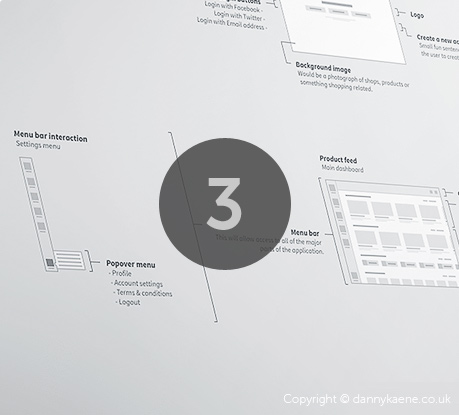
    The user’s point of view and their experience of using the site and its content is what is ultimately important. All participants agree on simplification on a visual and interaction level. Traditional websites will continue to adopt mobile app UI patterns precisely because they offer a more simple and efficient user experience, which brings us to the next point, “App Style Interfaces”...
  • 4. App Style Interfaces


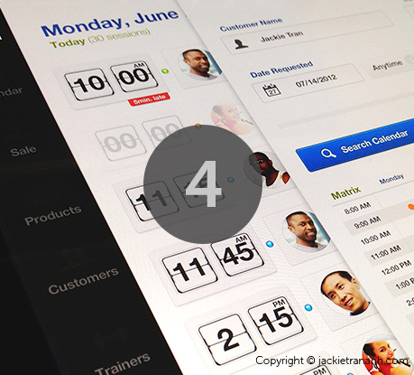
    Over the next few months we’re going to witness a process of transformation for most desktop websites, which will increasingly imitate the style and interfaces of mobile apps, unifying and simplifying content and design and at the same time facilitating the creation of responsive projects.
  • 5. The unification of desktop and mobile into a single version


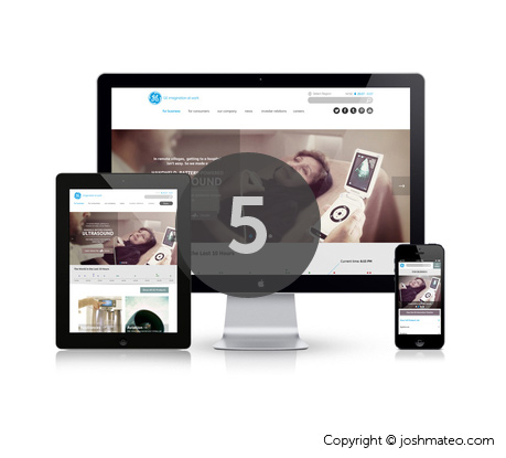
    Responsive, Adaptative Content, Mobile First, Device Agnostic, Resolution Independent; all these terms are evolving towards a common destination which is the unification of desktop and mobile into a single version. But how to integrate apps and experiences through multiple devices?
    Our experts foresee an evolution in responsive. The trend until now has been to adapt content, but many voices now argue for unification.
  • 6. SVG and Responsive Techniques


    The search for multi-platform versions and cross-platform technologies will lead to responsive techniques such as SVG, webfonts, design with typography and icon fonts evolving and becoming more widespread, and on a visual level we’ll see trends like the ones coming up in the next point...
  • 7. Flat Colors and no more skeuomorphism


    The main visual trends identified by our participants were simplicity, minimalism, clear layouts, app-style interfaces, design focusing on typography, less decoration, less skeuomorphic interfaces, flat style, flat colors... This exact trend towards simplification in design and seemingly aesthetic matters, such as flat colors, responds to the need to create adaptative projects and serve images and scalable elements to retina displays with excellent performance on 3G connections, but also to mobiles with inferior provisions from the non-western market and to devices such as eReaders.
  • 8. Technology Agnostic


    Technology agnostic, of course, is the main idea.
    In web standards based applications, looking at the data graphic below we can see that the HTML/ CSS/ Javascript trio is the “primordial soup”. We then have lots of CSS in its various forms, custom filters, CSS Effects, 3D Transforms, Preprocessors and technologies such SVG or webfonts related to responsive techniques. It’s worth pointing out the growing interest in Javascript for web app development, but when it comes to effects, animation, filters etc., it will step aside to make way for the new capacities of CSS3.
    In server-side languages Ruby and Python and experimentation with Node.js are becoming more widespread. The multiplicity of frameworks and builders will be another constant.
    On the other hand we have the development of native apps for iOS and Android, where there’s nothing new either, just the intense and continual increase in demand and the desire to have more suitable cross-platform technologies, based on web standard technologies or otherwise. The spread of Android means demand for Android apps seems to be gaining in importance.
    Another thing that really stands out is the growing interest in WebGL, particularly among the big agencies. This technology is raising high expectations thanks to its performance and the potential it offers on an experimental level.
  • 9. Experimentation and innovation in device sensors and interaction


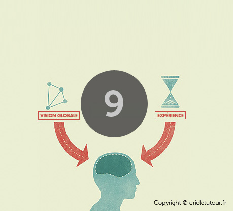
    It will be a time for getting the best out of mobile technology and creating new user experiences, exploring device sensors and experimenting widely with touch-enabled-interfaces, speech-based, etc.
  • 10. The internet of things


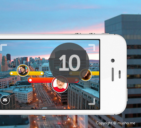
    Soon we’ll be able to communicate not only with our fridges and televisions, but even with devices with tiny LED screens, In-kitchen devices, In-car audio interfaces... Hundreds of totally different platforms will spring up. Without a doubt, interactive TV will have a leading role. How will we be able to evolve towards a rational unification of all this?
    As Aarron Walter says, we’ll see an “Ecosystem of connected services” and we’ll have to work hard on integrating services and user accounts.

    source:http://www.awwwards.com/10-web-design-trends-for-2013.html

Friday 17 May 2013

5 Simple Web Design Tips To Improve Site Conversions

Great web design is not about winning awards or having the most colorful website. Its about the experience your users encounter when they get to your site and achieve what you have set out for them to do.
If you are a small business owner most likely your site is to create new leads and sales.
Here are 5 simple tips that will help improve conversions:

1. Layout

Make your layout support your content; not the other way around.
You want the eye to flow from your main message and supporting attributes (testimonials, blog posts, videos, really neat things your company has achieved) right to your conversion points. Remember, your site is not there to showcase how great your company is but to achieve your business goal: sales or leads.
clip_image002
The example on the left shows your hard conversion point, title, and a picture above the fold.
The eye has enough room to follow a path to the next headline and its supporting point. There is no horizontal line "at the fold" breaking up the page; this lets the user know there is more content.
The other examples bombard with imagery, no text. Consequently there is no flow from one message to the other. The flow through the page is cut off with cluttered images and text. These layouts create a horizontal line "at the fold"; the user may not even know to scroll down to get to understand what your company does.

2. Colors

If you have strong colors in your logo pull them out and use them as highlights rather than the base of your site: just because your logo is black and red certainly does not mean your site should be.
  • use light backgrounds; it is extremely hard to read anything more than a headline on a dark colored background
  • use a single color for all your calls to action (This will help call them out)
  • be consistent with your color usage
Overwhelming colors = overwhelmed visitors.

3. Calls To Action

image
Make sure your calls to action sit in your visitor's path above the fold.
Make sure primary calls to action are larger and have a prominent position over your soft conversion points like a sign up newsletter buttons etc.
Just because everyone zigs, does not mean you have to zag. You still want to be consistent to what is out there on the web. Be aware of your demographic and what they are used to in terms of usability and style and always make sure your CTA is prominent and stands out.
Remember to test, test, test and find out what works for your site! You can use these free CSS button sites for testing:
  • cssbuttongenerator.com
  • CSS Tricks Button Maker
For more on effective Calls to Actions see 50 Effective and Creative Call to Action Buttons

4. Use Font Size To Indicate Importance

If all your text is the same size nothing seems important on the page and your message will get lost.
By creating a hierarchy you will have a visual flow from what is important to less.

Are You Reading This?

Now are you reading this?

Now this!

5. Stock Imagery

Ever seen this image? She not only sells condos but ALSO answers your phones!
clip_image010
Avoid common stock images. We know the girl selling condos in that billboard ad is definitely not the same answering your phones.
Stock images are okay if used properly. Otherwise they just seem cold and uninviting. Check out Stock Xchng for free stock photos that dont look like stock photos.
Pictures are great; just make sure that the pictures make sense for your business. You want potential consumers to see themselves in your brand so why not use them in your imagery?
By following these simple tips, you will be on your way to helping your potential customers easily find the information they need to make a more informed decision about your brand and the service/product you provide and increase your conversions.

Monday 13 May 2013

6 Tips to Simplify Your Website’s Design

Sometimes I’ll just stare at a website for minutes on end, trying to figure out why it’s so confusing. Unfortunately, most websites we visit are far more complex than they need to be. I don’t mean complex in terms of functionality, but in terms of all the types of content you are confronted with on a single page. In addition to the basics—a logo, navigation menus, page title, the main content, and one or two calls to action—most web pages are simply overrun with advertisements, social media widgets, and lures to even more (supposedly related) content. Follow these tips to cut the clutter.
 
1. Reduce the bling. Upon first glance at a web page, visitors make a quick, subtle judgment that, I believe, goes something like this: “Look at all those fancy widgets. They must have a team of programmers working night and day on this thing! Woah, Bing ads. They’re connected, and rich!” These eyesores just encourage bad design to flourish on the web.
 
2. Purpose should be a guiding principle of web design. Suppose books were designed without purpose. Gone would be the days of settling in to a good story: When squeezed into a narrow column of text, that narrative would be drowned out by the noise of surrounding advertisements. Before you could dive into a tale, you’d be pulled away by the promise of another. “Who’s Pip’s secret sponsor? Oooh, A Tale of Two Cities sounds good. I wonder if I can get that on my Kindle…” No reader would ever finish a book.
 
3. Allow users to read. Currently, the big players on the web receive such a large volume of traffic that crowding their pages with as many opportunities to click makes statistical sense. When hundreds of thousands of users access a web page on a daily basis, it’s highly probable that a significant number of them will click a link (any link will do) that either continues their visit or sends them elsewhere via a paid advertisement. Either scenario is valuable to the site’s owner, but not the user. Instead, focus on making the viewer’s experience more satisfying.
 
4. Highlight quality and relevant information for viewers. Give new and top content proper placement to direct viewers’ attention to what they are looking for. This placement does not need to be image or widget heavy.
 
5. Satisfying web experiences rely upon focused attention, the kind you need in order to read and comprehend text. The more a page is divided by non-overlapping, attention-seeking magisteria, the less likely it is to win your attention for the long-term. While mass-media sites can profit from visitors that are mostly just passing through, smaller sites need to cultivate visitors who will stay a while by creating an environment conducive to their focused attention. Remember, most websites offer content to inform and inspire prospective customers of a product or service.
 
6. Effective web design and good business are not mutually exclusive, but that case must be made in light of what most web users are used to. If a bigger, more established competitor employs certain tactics that make sense given its large volume of traffic, the question of whether to adopt a similar approach should be answered on the basis of reasonable expectations. Few websites see explosive growth overnight, and those that do struggle to sustain it. If you’re the little guy, the smart thing to do is realize that the audience you’re after has already given some of its attention to the big guy. To win (and keep) their attention, you’re going to need to do things differently from your competitors, things that fall in line with the unique purpose of your website, which is where good web design starts.

Wednesday 8 May 2013

Tips to design your website


Branding your Business with best web design features- The website is the first image or reflection of your business in the online world.  Your website acts as an exclusive fastest medium to attract customers not only from your local area but from across the globe.  To give the global customers a good and effective impression of your business portfolio you should emphasize on branding your business while getting your website designed. Ask your web design company to create an attractive website template to include your business logo with a complementing tagline in all the website pages. Design an informative page detailing the best relevant information about your business history and who you are. Ask your web designing firm to add a bookmarking option on all the webpage to let the users add your website to their favorite list.

Opt for a User Friendly Navigation in the Website- A well structured website with fast speed and user friendly interface always has more potential to attract and engage customers than a website having more products to offer but a clumsy navigation to follow. Categories your products in groups, ask your web designer to create an innovative menu with simple easy to follow user friendly navigation. Make use of Back to Top / Back to Home Page / Back features wherever required while navigating the website.

Utilize optimized graphics on website: Get your web images optimized before you upload them on the website. Image optimization reduces the loading time and thus helps in faster loading of the website. Ask your website design company to create attractive thumbnails and insert alt text for your product images.

Content and Layout Presentation- The look and feel of your website and its content is the most important factor to get customers attracted towards your website. Always remember it's the website content only that can turn a prospect online customer to a real online buyer of your business product. Focus on presenting real, informative, valid, optimized and original content on your website. Avoid using Popup windows as they can only lead to customer disappointment.

Know your Customer- Design and include a customer feedback form in your website to get a feel of how your customer felt while navigating through your website. Opt for surveys and public polls from time to time to gather relevant customer information.

Link your Website- Emphasize on clear descriptive internal and external links on your website. Create a valid sitemap to include links to all the web pages of your website. Make sure all the external links are relevant and no frauds. Highlight all your links through different color scheme of course the scheme should match your website color scheme.

Create a 404 Page:  Get a valid 404 page with a back link to your home page created for your website. The 404 page tells the online audience about the removal of any webpage.

Follow SEO standards: Get your website optimized for major search engines. Create crisp, informative, relevant title and descriptions of all your web pages. Good and original content of your website with well defined natural linking strategy can lead you good ranks among the top search engines like Google, Bing and Yahoo.
source: www.articlesbase.com/web-design-articles/tips-to-design-your-website-6574315.html