Great web design is not about winning awards or having the most
colorful website. Its about the experience your users encounter when
they get to your site and achieve what you have set out for them to do.
If you are a small business owner most likely your site is to create new leads and sales.
Here are 5 simple tips that will help improve conversions:
You want the eye to flow from your main message and supporting attributes (testimonials, blog posts, videos, really neat things your company has achieved) right to your conversion points. Remember, your site is not there to showcase how great your company is but to achieve your business goal: sales or leads.

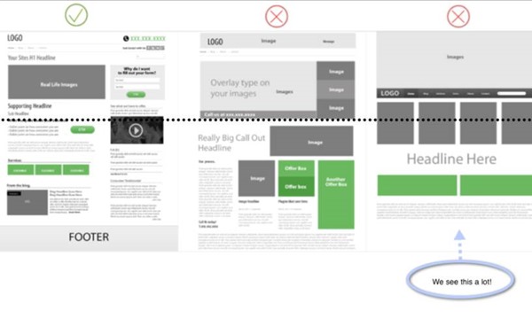
The example on the left shows your hard conversion point, title, and a picture above the fold.
The eye has enough room to follow a path to the next headline and its supporting point. There is no horizontal line "at the fold" breaking up the page; this lets the user know there is more content.
The other examples bombard with imagery, no text. Consequently there is no flow from one message to the other. The flow through the page is cut off with cluttered images and text. These layouts create a horizontal line "at the fold"; the user may not even know to scroll down to get to understand what your company does.

Make sure your calls to action sit in your visitor's path above the fold.
Make sure primary calls to action are larger and have a prominent position over your soft conversion points like a sign up newsletter buttons etc.
Just because everyone zigs, does not mean you have to zag. You still want to be consistent to what is out there on the web. Be aware of your demographic and what they are used to in terms of usability and style and always make sure your CTA is prominent and stands out.
Remember to test, test, test and find out what works for your site! You can use these free CSS button sites for testing:
By creating a hierarchy you will have a visual flow from what is important to less.

Avoid common stock images. We know the girl selling condos in that billboard ad is definitely not the same answering your phones.
Stock images are okay if used properly. Otherwise they just seem cold and uninviting. Check out Stock Xchng for free stock photos that dont look like stock photos.
Pictures are great; just make sure that the pictures make sense for your business. You want potential consumers to see themselves in your brand so why not use them in your imagery?
By following these simple tips, you will be on your way to helping your potential customers easily find the information they need to make a more informed decision about your brand and the service/product you provide and increase your conversions.
If you are a small business owner most likely your site is to create new leads and sales.
Here are 5 simple tips that will help improve conversions:
1. Layout
Make your layout support your content; not the other way around.You want the eye to flow from your main message and supporting attributes (testimonials, blog posts, videos, really neat things your company has achieved) right to your conversion points. Remember, your site is not there to showcase how great your company is but to achieve your business goal: sales or leads.

The example on the left shows your hard conversion point, title, and a picture above the fold.
The eye has enough room to follow a path to the next headline and its supporting point. There is no horizontal line "at the fold" breaking up the page; this lets the user know there is more content.
The other examples bombard with imagery, no text. Consequently there is no flow from one message to the other. The flow through the page is cut off with cluttered images and text. These layouts create a horizontal line "at the fold"; the user may not even know to scroll down to get to understand what your company does.
2. Colors
If you have strong colors in your logo pull them out and use them as highlights rather than the base of your site: just because your logo is black and red certainly does not mean your site should be.- use light backgrounds; it is extremely hard to read anything more than a headline on a dark colored background
- use a single color for all your calls to action (This will help call them out)
- be consistent with your color usage
3. Calls To Action

Make sure your calls to action sit in your visitor's path above the fold.
Make sure primary calls to action are larger and have a prominent position over your soft conversion points like a sign up newsletter buttons etc.
Just because everyone zigs, does not mean you have to zag. You still want to be consistent to what is out there on the web. Be aware of your demographic and what they are used to in terms of usability and style and always make sure your CTA is prominent and stands out.
Remember to test, test, test and find out what works for your site! You can use these free CSS button sites for testing:
- cssbuttongenerator.com
- CSS Tricks Button Maker
4. Use Font Size To Indicate Importance
If all your text is the same size nothing seems important on the page and your message will get lost.By creating a hierarchy you will have a visual flow from what is important to less.
Are You Reading This?
Now are you reading this?
Now this!
5. Stock Imagery
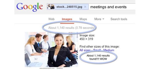
Ever seen this image? She not only sells condos but ALSO answers your phones!
Avoid common stock images. We know the girl selling condos in that billboard ad is definitely not the same answering your phones.
Stock images are okay if used properly. Otherwise they just seem cold and uninviting. Check out Stock Xchng for free stock photos that dont look like stock photos.
Pictures are great; just make sure that the pictures make sense for your business. You want potential consumers to see themselves in your brand so why not use them in your imagery?
By following these simple tips, you will be on your way to helping your potential customers easily find the information they need to make a more informed decision about your brand and the service/product you provide and increase your conversions.
Awesome tips Paul. Thanks for sharing. every web dsigner should know these tips to make their site more acceptable to visitors.
ReplyDeletesmall business web design
very nice tips for web designers. Thanks for sharing.
ReplyDeleteweb development company in chennai
Great post about website design maintenance. Its helpful for every web designer. Thanks for your awesome sharing.
ReplyDeletewebsite design